40.1 Introduction to linear regression

We discussed linear regression briefly in the previous course. And we fit a few models with non-informative priors. Here, we’ll provide a brief review, demonstrate fitting linear regression models in JAGS And discuss a few practical skills that are helpful when fitting linear models in general.
This is not meant to be a comprehensive treatment of linear models, which you can find in numerous courses and textbooks.
Linear regression is perhaps the simplest way to relate a continuous response variable to multiple explanatory variables.
This may arise from observing several variables together and investigating which variables correlate with the response variable. Or it could arise from conducting an experiment, where we carefully assign values of explanatory variables to randomly selected subjects. And try to establish a cause-and-effect relationship.
A linear regression model has the following form:
y_i=\beta_0+\beta_1 x_i +\ldots+ \beta_k x_k + \varepsilon_i \\ \varepsilon_i \stackrel {iid} \sim N(0,\sigma^2) \tag{40.1}
This describes the mean, and then we would also add an error, individual term for each observation. We would assume that the errors are IID from a normal distribution means 0 variance \sigma^2 for observations 1 \ldots k.
Equivalently we can write this model for y_i directly as y_i given all of the x_i values, betas and a constant variance \sigma^2. Again, k is the number of predictor variables.
y_i\mid x_i,\beta_i,\sigma^2 \sim N(\beta_0+\beta_1 x_i +\ldots+ \beta_k x_k, \sigma^2)\\ \beta_i \sim \mathbb{P}r(\beta_i) \\ \sigma^2 \sim \mathbb{P}r(\sigma^2) \tag{40.2}
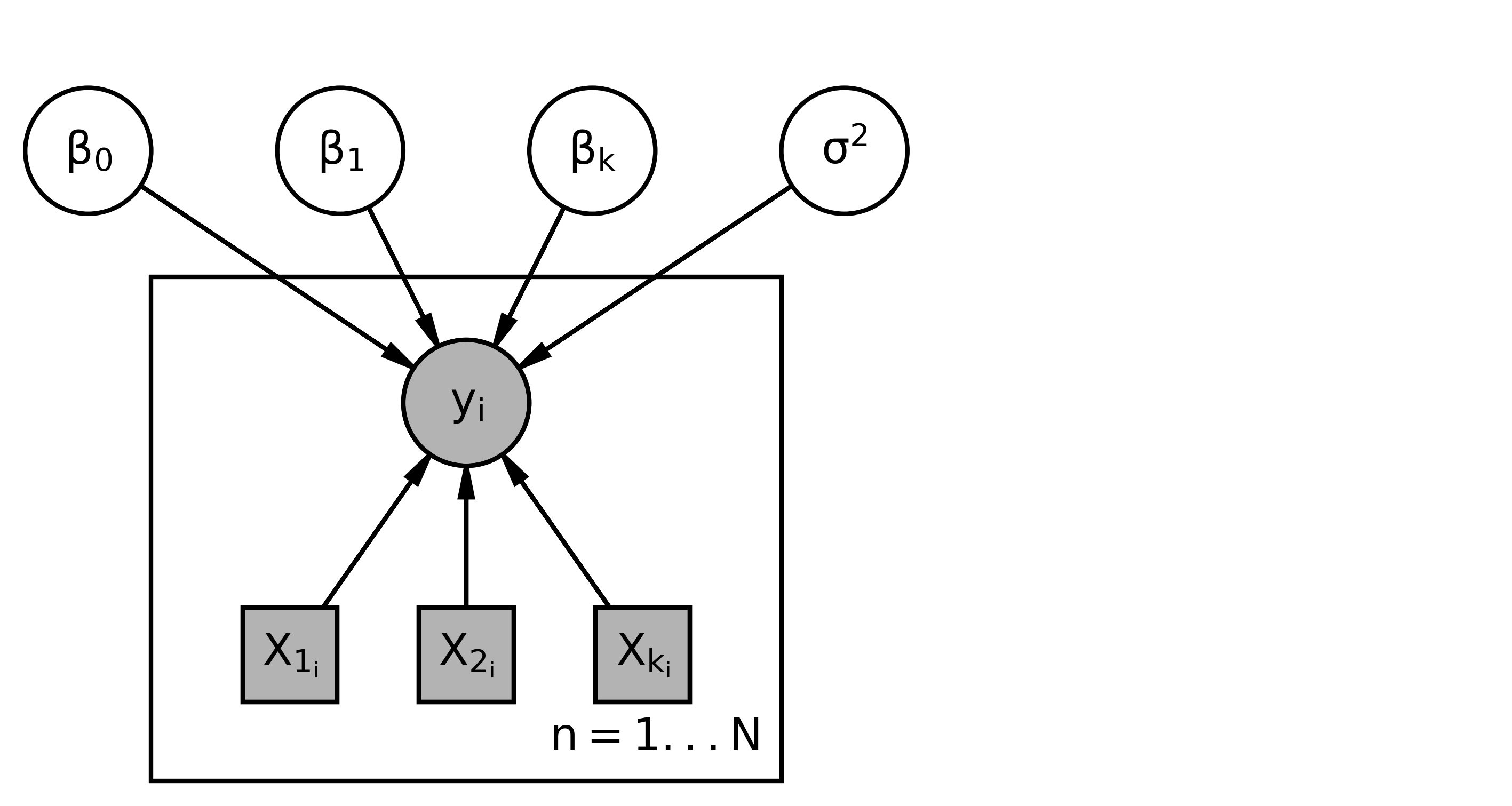
This yields the following graphical model structure.
ImportantUnderstanding the Graphical Models
- This graphical model uses plate notation - We’ll start with a plate for all of our different y variables, - It is repeated i = 1 \ldots N times - y_i, are random variable - (indicated by a circle) - they are observed - indicated by a filled shape. - X_i variables. - they are drawn as squares around to indicate that they are constants and not random variables. - We’re always conditioning on the Xs. So they’ll just be constants. - they are observed, so they are filled in. - The y_i depend on the values of the x and the values of these parameters. So, we have \beta_0, \ldots, \beta_k. - Sigma squared. - Since the y_i depend on all of these, so this would be the graphical model representation.
The terms of a linear model are always linearly related because of the structure of the model.
But the model does not have to be linear necessarily in the xy relationship. For example, it may be that y is related linearly to x^2. Hence we could transform the x and y variables to get new x’s and new y’s but we would still have a linear model. However, in that case, if we transform the variables, we must be careful about how this changes the final interpretation of the results.
ImportantInterpreting Coefficients
The basic interpretation of the \beta_i coefficients is:
While holding all other X variables constant, if we increases X_i by one then the mean of \bar{y} is expected to increase by \beta_i .
That is \beta_i describes how the \bar{y} changes with changes in X_i, while accounting for all the other X variables.
\beta \approx \frac{\partial \bar{y} }{\partial x_i} \tag{40.3}
That’s true for all of the x variables.
WarningRegression assumptions
We’re going to assume that
- The y s are independent of each other, given the x s.
- The y_i s have the same variance.
- The residuals are normally distributed with mean 0 and variance \sigma^2.
These are actually strong assumptions that are not often not realistic in many situations.
There are many statistical models to address that.
We’ll look at some hierarchical methods in the coming lessons.
40.1.1 Priors
The model is not complete until we add the prior distributions.
So we might say \beta_0 comes from its prior.
\beta_1 would come from its prior, and so forth for all the \betas. And sigma squared would come from its prior.
The most common choice for prior on the \beta s, is a Normal distribution. Or we can do a Multivariate normal for all of the betas at once.
This is conditionally conjugate and allows us to do Gibbs sampling.
If we want to be non-informative, we can choose Normal(0,\sigma^2=1e6) priors with very large variance. Which are practically flat for realistic values of beta. The non-informative priors used in the last class are equivalent to using normal priors with infinite variance.
We can also use the conditionally conjugate InverseGamma() prior for \sigma^2 that we’re familiar with.
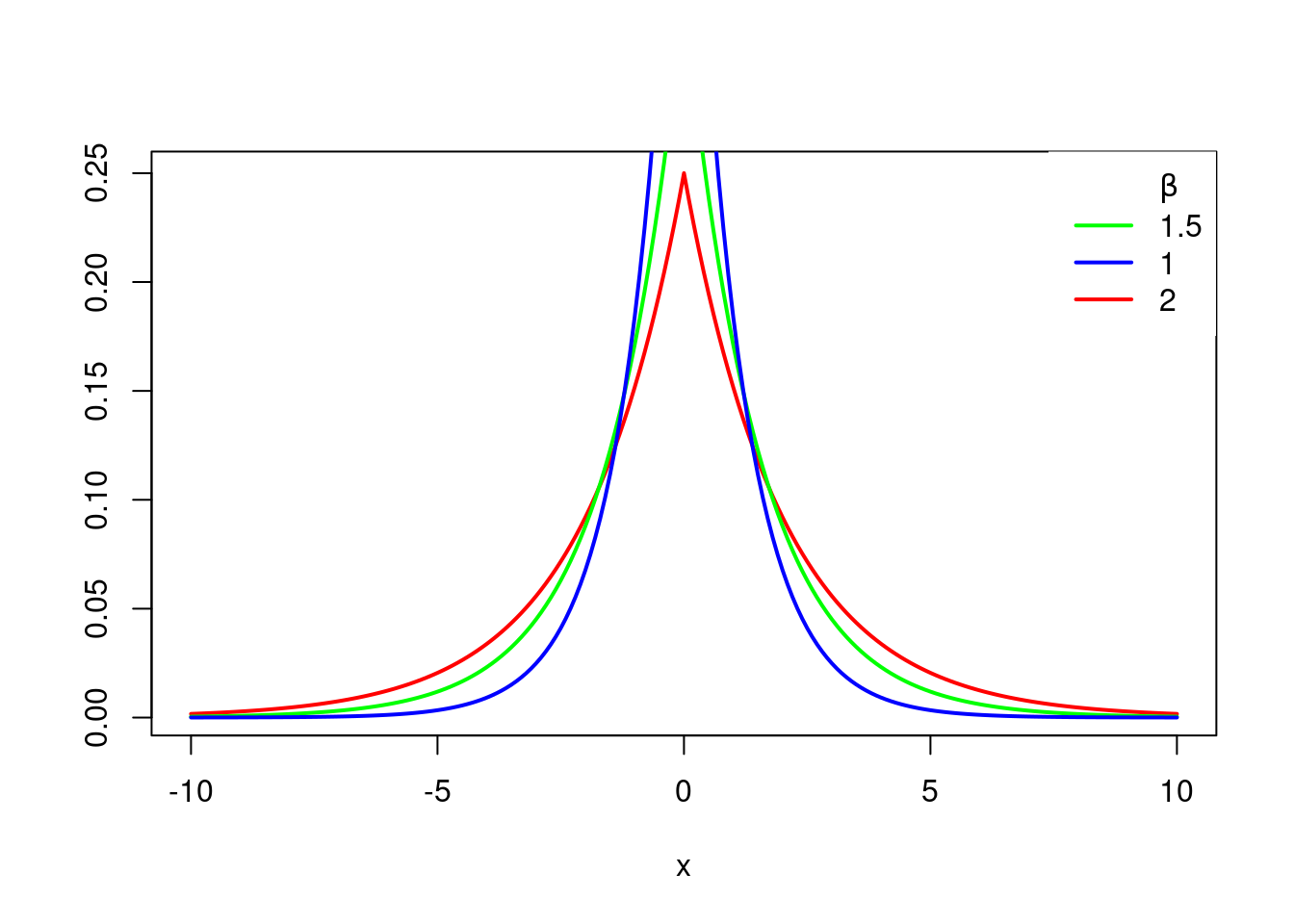
Another common prior for the betas is Double exponential, or the Laplace prior, or Laplace distribution.
The Laplace prior has this density:
f(x\mid \mu,\beta)=\frac{1}{2\beta} e^{|\frac{x-\mu}{\beta}|} \tag{40.4}
where:
- \mu is the location parameter and
- \beta is the scale parameter.
The case where \mu = 0 and \beta = 1 is called the standard double exponential distribution
f(x)=\frac{1}{2} e^{|x|} \tag{40.5}
And the density looks like this.
# Grid of X-axis values
x <- seq(-10, 10, 0.1)
plot(x,  ddexp(x, 0, 2), type = "l", ylab = "", lwd = 2, col = "red")
lines(x, ddexp(x, 0, 1.5), type = "l", ylab = "", lwd = 2, col = "green")
lines(x, ddexp(x, 0, 1), type = "l", ylab = "", lwd = 2, col = "blue")
legend("topright",
       c(expression(paste(, beta)), "1.5","1", "2"),
       lty = c(0, 1, 1, 1),
       col = c("red","green", "blue"), box.lty = 0, lwd = 2
      )

#x <- rdexp(500, location = 2, scale = 1)
#de_sample=ddexp(x, 2, 1)
#CDF <- ecdf(de_sample )
#plot(CDF)
loc, scale = 0., 1.
s = np.random.laplace(loc, scale, 1000)
count, bins, ignored = plt.hist(s, 30, density=True)
x = np.arange(-8., 8., .01)
pdf = np.exp(-abs(x-loc)/scale)/(2.*scale)
plt.plot(x, pdf);
g = (1/(scale * np.sqrt(2 * np.pi)) *
np.exp(-(x - loc)**2 / (2 * scale**2)))
plt.plot(x,g);It’s called double exponential because it looks like the exponential distribution except it’s been reflected over the y axis. It has a sharp peak at x equals 0, or beta equals 0 in this case, which can be useful if we want to do variable selection among our x’s. Because it’ll favor values in your 0 for these betas.
This is related to the popular regression technique known as the LASSO.
More information is available from:
41 Lesson 7.2 Code - Setup & Data
As an example of linear regression, we’ll look at the Leinhardt data from the car package in R.
data("Leinhardt")
?Leinhardt
head(Leinhardt)- 1
-
use the
datafunction and tell it which data set we want. - 2
-
browse the documentation for the dataset using
?operator - 3
-
look at the
headof the data set.
          income infant   region oil
Australia   3426   26.7     Asia  no
Austria     3350   23.7   Europe  no
Belgium     3346   17.0   Europe  no
Canada      4751   16.8 Americas  no
Denmark     5029   13.5   Europe  no
Finland     3312   10.1   Europe  no
As an example of linear regression, we’ll look at the Leinhardt data from the car package in R.
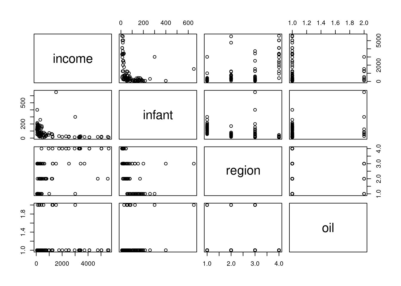
The Leinhardt dataset contains data on infant mortality for 105 nations of the world around the year 1970. It contains four variables:
- Per capita income in USD.
- Infant mortality rate per 1,000 live births.
- A factor indicating which region of the world this country is located.
- And finally, whether this country exports oil as an indicator variable.
str(Leinhardt)- 1
-
We can also look at the structure of the data using
strfunction
'data.frame':   105 obs. of  4 variables:
 $ income: int  3426 3350 3346 4751 5029 3312 3403 5040 2009 2298 ...
 $ infant: num  26.7 23.7 17 16.8 13.5 10.1 12.9 20.4 17.8 25.7 ...
 $ region: Factor w/ 4 levels "Africa","Americas",..: 3 4 4 2 4 4 4 4 4 4 ...
 $ oil   : Factor w/ 2 levels "no","yes": 1 1 1 1 1 1 1 1 1 1 ...
41.1 EDA
pairs(Leinhardt)- 1
-
Using
pairsto investigate the marginal relationships between each of the four variables.
41.1.0.1 Simple linear Model
We’ll start with a simple linear regression model that relates infant mortality to per capita income.
plot(infant ~ income, data=Leinhardt)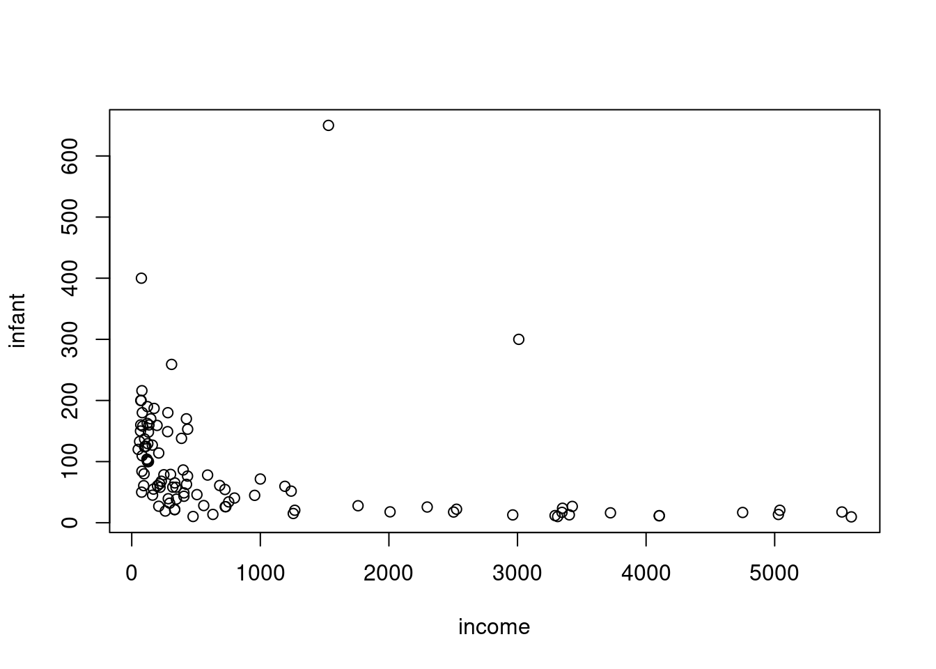
hist(Leinhardt$infant)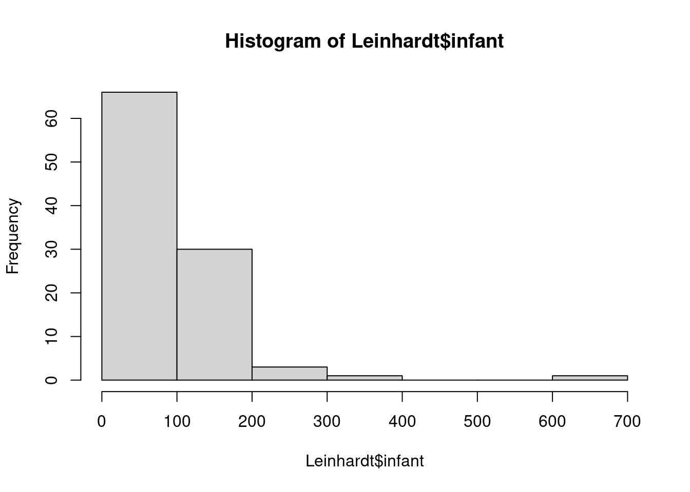
this is right-skewed (many small values and a number of much larger one)
hist(Leinhardt$income)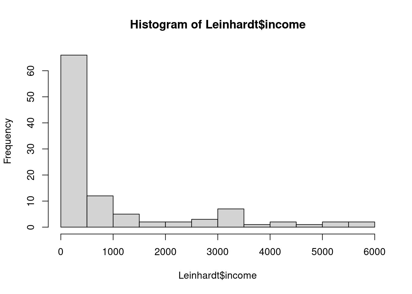
also right-skewed.
this indicates that we may do better if we do a log transform on these two variables.
41.1.0.2 Log-Log Linear Model
Leinhardt$loginfant = log(Leinhardt$infant)
Leinhardt$logincome = log(Leinhardt$income)
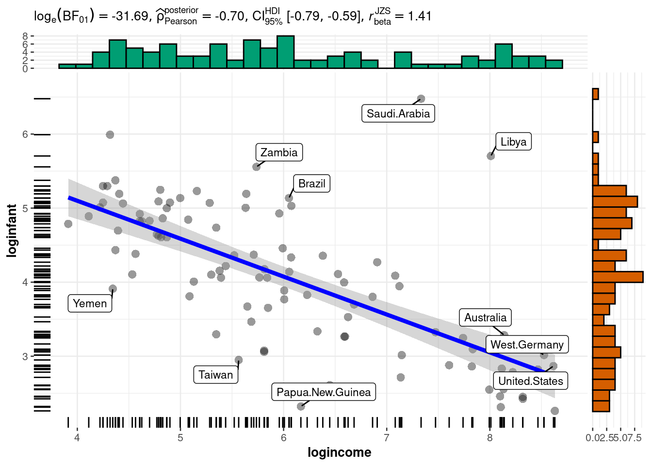
plot(loginfant ~ logincome,data=Leinhardt)- 1
- log transform infant column.
- 2
- log transform income column.
- 3
- scatter plot of the log log transformed data.
Since infant mortality and per capita income are positive and right-skewed quantities, we consider modeling them on the logarithmic scale. A linear model appears much more appropriate on this scale.
scatterplot(loginfant ~ logincome,data=Leinhardt)- 1
- scatterplot with a regression fit and uncertainty for the data
41.1.1 Modeling
The reference Bayesian analysis (with a non-informative prior) is available directly in R.
lmod0 = lm(loginfant ~ logincome, data=Leinhardt)
summary(lmod0)lm(formula = loginfant ~ logincome, data = Leinhardt)
Residuals:
Min 1Q Median 3Q Max
-1.66694 -0.42779 -0.02649 0.30441 3.08415
Coefficients:
Estimate Std. Error t value Pr(>|t|)
(Intercept) 7.14582 0.31654 22.575 <2e-16 ***
logincome -0.51179 0.05122 -9.992 <2e-16 ***
---
Signif. codes: 0 '***' 0.001 '**' 0.01 '*' 0.05 '.' 0.1 ' ' 1
Residual standard error: 0.6867 on 99 degrees of freedom
(4 observations deleted due to missingness)
Multiple R-squared: 0.5021, Adjusted R-squared: 0.4971
F-statistic: 99.84 on 1 and 99 DF, p-value: < 2.2e-16- 1
- intercept is \gg its error so it appears statistically significant (***)
- 2
-
posterior mean
logincometoo - 3
- Residual standard error gives us an estimate of the left over variance after fitting the model.
- 4
- 4 rows were dropped due to missing values
- 5
- Adjusted R-squared is the explained variance adjusted for degrees of freedom
42 Lesson 7.3 Code - Model in JAGS
Now we’ll fit this model in JAGS. A few countries have missing values, and for simplicity, we will omit those.
dat = na.omit(Leinhardt)Loading required package: codaLinked to JAGS 4.3.2Loaded modules: basemod,bugsmod1_string = " model {
for (i in 1:n) {
y[i] ~ dnorm(mu[i], prec)
mu[i] = b[1] + b[2]*log_income[i]
}
for (i in 1:2) {
b[i] ~ dnorm(0.0, 1.0/1.0e6)
}
prec ~ dgamma(5/2.0, 5*10.0/2.0)
sig2 = 1.0 / prec
sig = sqrt(sig2)
} "
set.seed(72)
data1_jags = list(y=dat$loginfant, n=nrow(dat), log_income=dat$logincome)
params1 = c("b", "sig")
inits1 = function() {
inits = list("b"=rnorm(2,0.0,100.0), "prec"=rgamma(1,1.0,1.0))
}
mod1 = jags.model(textConnection(mod1_string), data=data1_jags, inits=inits1, n.chains=3)
update(mod1, 1000)
mod1_sim = coda.samples(model=mod1, variable.names=params1, n.iter=5000)
mod1_csim = do.call(rbind, mod1_sim)- 1
- likelihood (we are using jags’ mean, precision parameterization)
- 2
- linear part of the model
- 3
- prior for the betas
- 4
- prior - Inverse Gamma on the variation via a precision = 1/\sigma^2
- 5
- we use the deterministic relationship between the precision and the variance to get to the standard deviation
- 6
- we wish to monitor the standard deviation is more interpretable than the precision
- 7
- the data is a list of the log-transformed infant mortality, the number of observations, and the log-transformed income
- 8
- initial values: two Normals for beta and one from the gamma
- 9
- putting the parts of the spec together
- 10
- 1000 iterations to burn in
- 11
- combine multiple chains by stacking the matrices
Compiling model graph
   Resolving undeclared variables
   Allocating nodes
Graph information:
   Observed stochastic nodes: 101
   Unobserved stochastic nodes: 3
   Total graph size: 404

Initializing model
43 Lesson 7.4 Model Checking- MCMC convergence
43.0.1 Convergence diagnostics for the Markov Chains
Before we check the inferences from the model, we should perform convergence diagnostics for our Markov chains.
par(mar = c(2.5, 1, 2.5, 1))
plot(mod1_sim)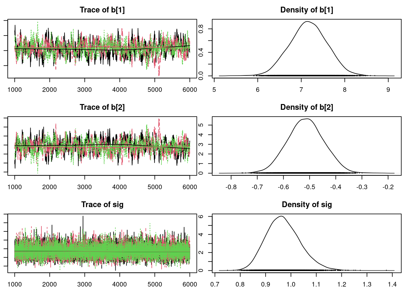
gelman.diag(mod1_sim)- 1
- Gelman Rubin diagnostics scale reduction close to 1 indicated MCMC convergence
Potential scale reduction factors:
Point est. Upper C.I.
b[1] 1 1
b[2] 1 1
sig 1 1
Multivariate psrf
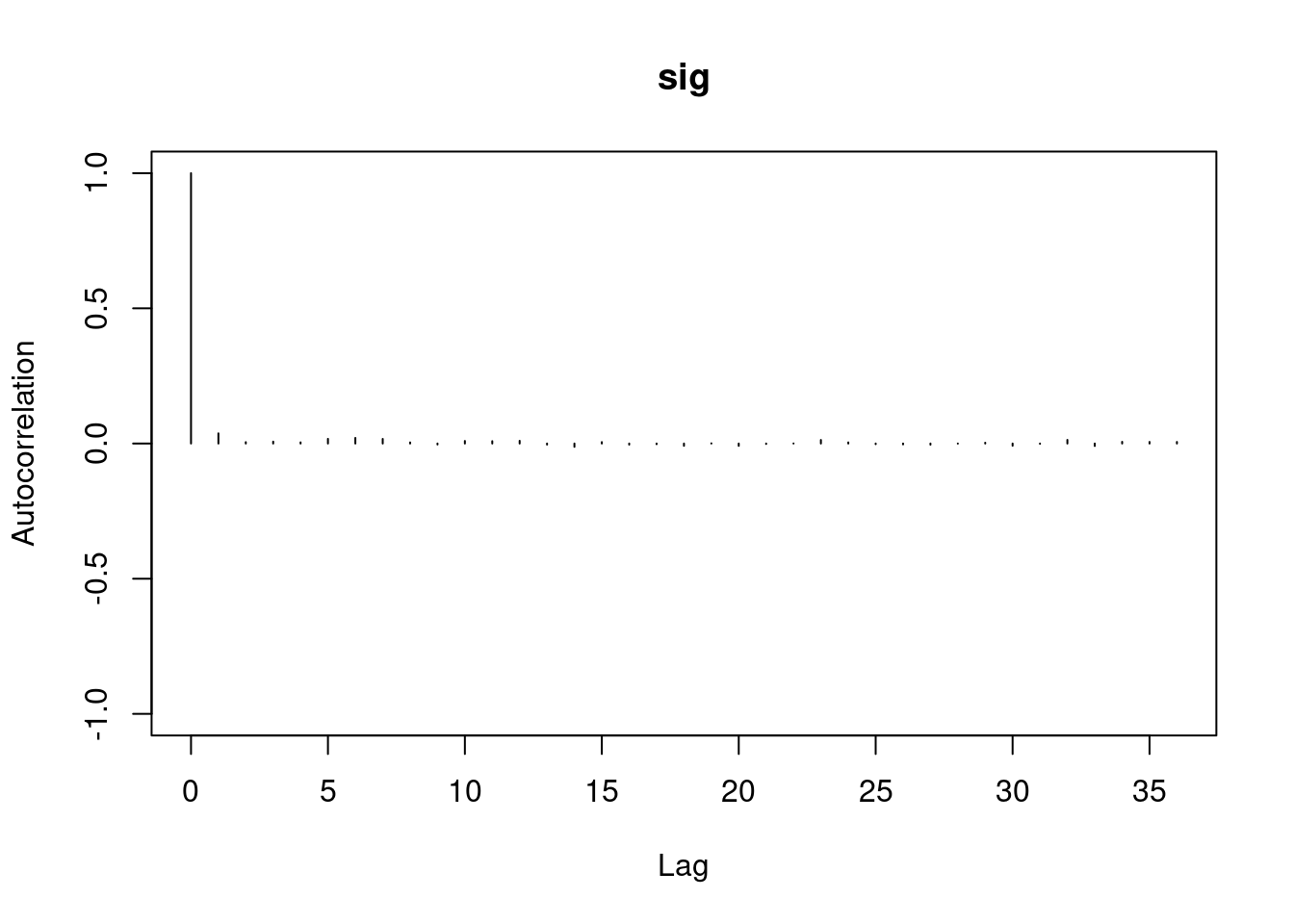
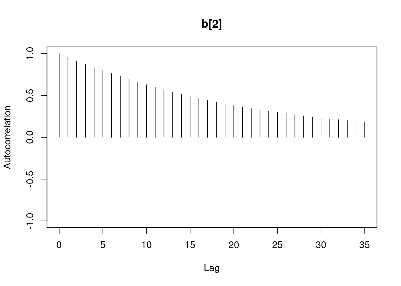
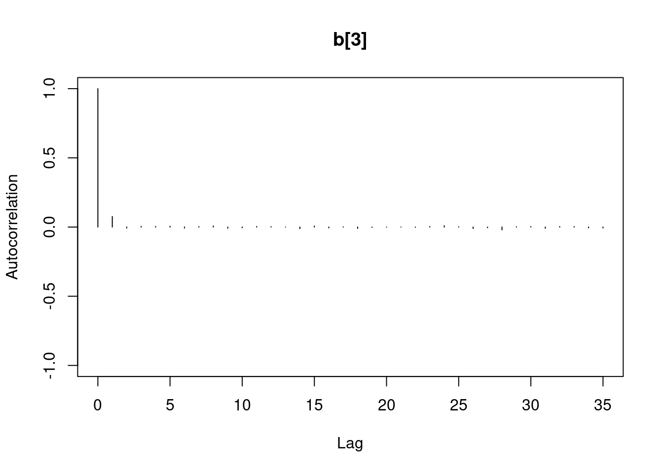
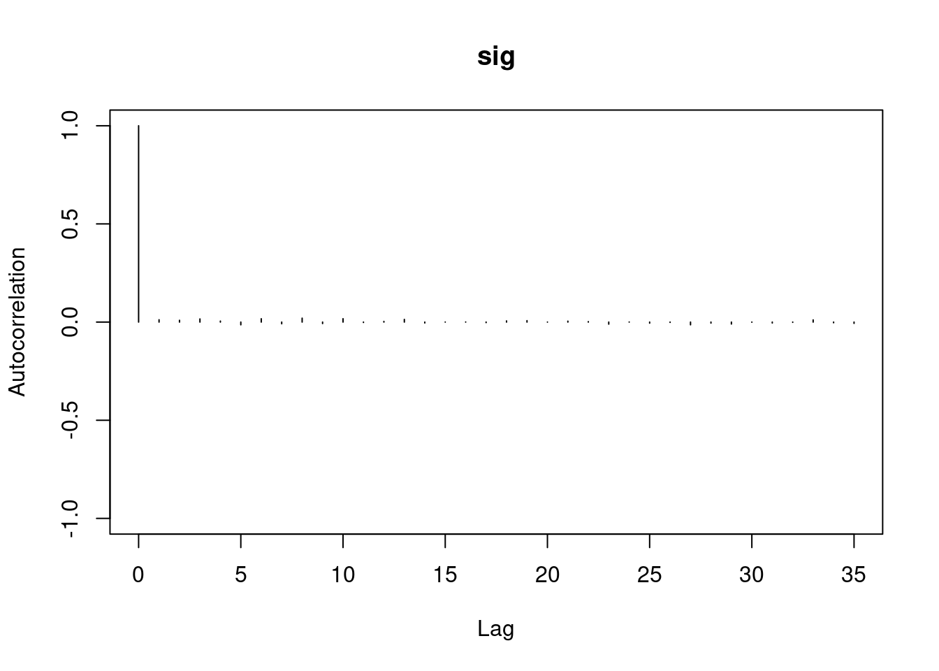
1autocorr.diag(mod1_sim)- 1
- high autocorrelation indicates a low sample size
             b[1]      b[2]        sig
Lag 0  1.00000000 1.0000000 1.00000000
Lag 1  0.94911947 0.9493718 0.02089624
Lag 5  0.77330363 0.7732531 0.01583530
Lag 10 0.59575635 0.5957846 0.00830528
Lag 50 0.07625817 0.0771218 0.01025275
#autocorr.plot(mod1_sim , auto.layout = F)
autocorr.plot(mod1_csim , auto.layout = F)

effectiveSize(mod1_sim)- 1
- checking the ESS
      b[1]       b[2]        sig
  384.5267   383.9621 13978.0381
the ess for sigma is good but for the betas 350 this is too low for estimating quantiles, it is enough to estimate the mean.
We can get a posterior summary of the parameters in our model.
summary(mod1_sim)
Iterations = 1001:6000
Thinning interval = 1
Number of chains = 3
Sample size per chain = 5000

1. Empirical mean and standard deviation for each variable,
   plus standard error of the mean:

        Mean      SD  Naive SE Time-series SE
b[1]  7.1341 0.43049 0.0035150      0.0219786
b[2] -0.5100 0.06964 0.0005686      0.0035641
sig   0.9711 0.06792 0.0005546      0.0005758

2. Quantiles for each variable:

        2.5%     25%     50%     75%   97.5%
b[1]  6.2688  6.8555  7.1339  7.4155  7.9881
b[2] -0.6480 -0.5554 -0.5097 -0.4654 -0.3695
sig   0.8499  0.9236  0.9670  1.0143  1.1164
Don’t forget that these results are for a regression model relating the logarithm of infant mortality to the logarithm of income.
43.1 Residual checks
Important
Analysis gets complicated quickly when we have multiple models. What we shall soon see is how to get residuals from the Bayesian model in Stan so we can compare it visually with the reference model we got using LM.
Checking residuals (the difference between the response and the model’s prediction for that value) is important with linear models since residuals can reveal violations of the assumptions we made to specify the model. In particular, we are looking for any sign that the model is not linear, normally distributed, or that the observations are not independent (conditional on covariates).
First, let’s look at what would have happened if we fit the reference linear model to the un-transformed variables.
lmod0 = lm(infant ~ income, data=Leinhardt)
plot(resid(lmod0)) # to check independence (looks okay)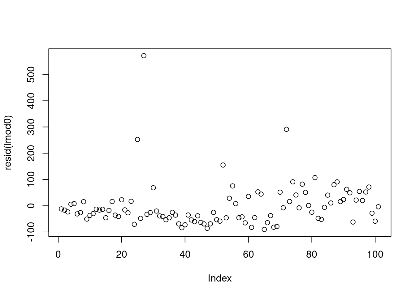
there should not be a pattern - but we can see an increase. This is not an issue and due to the data being presorted.
plot(predict(lmod0), resid(lmod0)) # to check for linearity, constant variance (looks bad)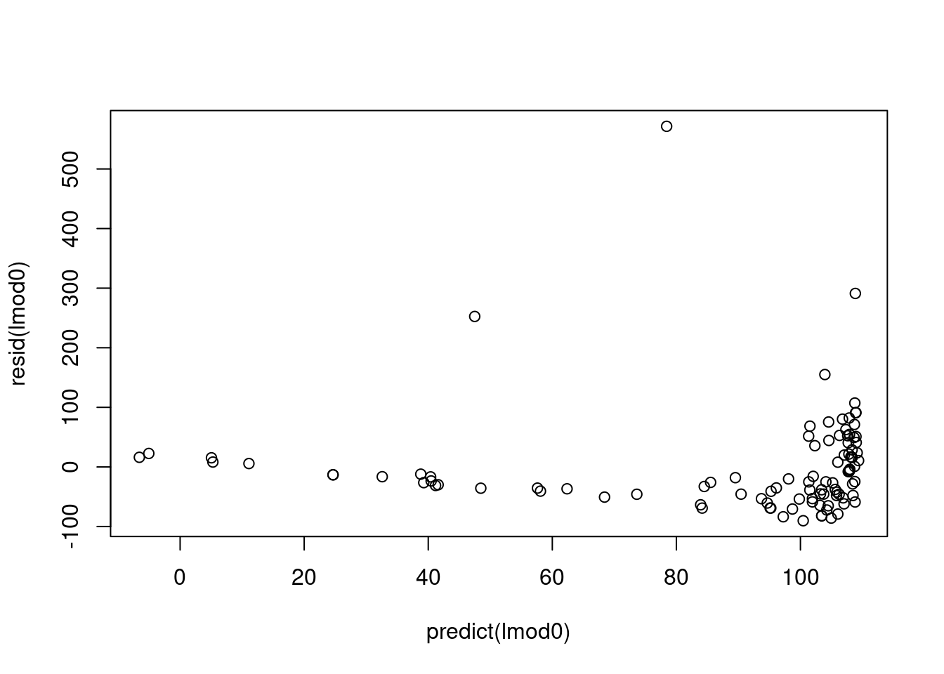
after 80 the variance starts increasing
qqnorm(resid(lmod0)) # to check Normality assumption (we want this to be a straight line)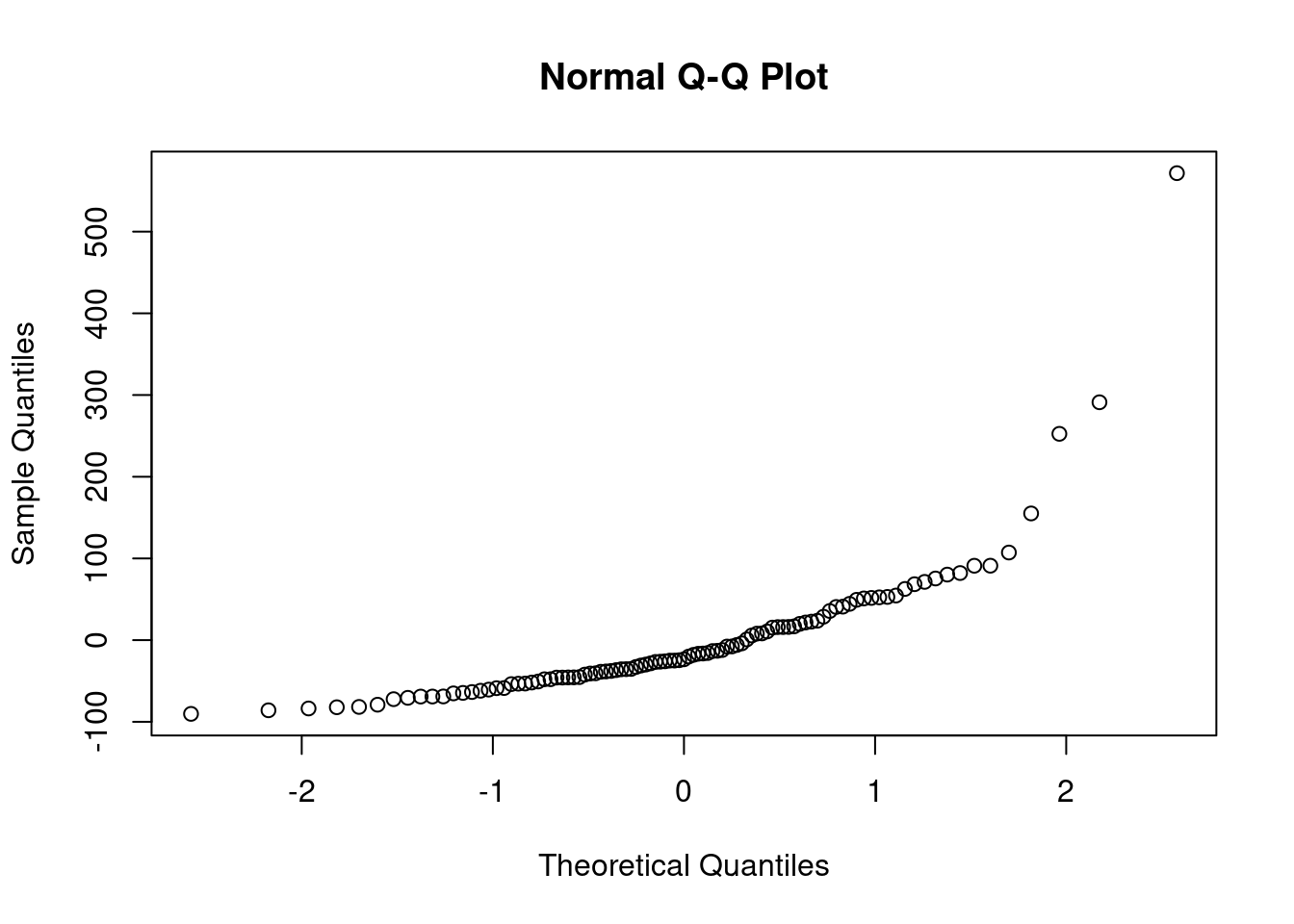
#?qqnormThis looks good except for the last few points.
Now let’s return to our model fit to the log-transformed variables. In a Bayesian model, we have distributions for residuals, but we’ll simplify and look only at the residuals evaluated at the posterior mean of the parameters.
X = cbind(rep(1.0, data1_jags$n), data1_jags$log_income)
head(X)
[,1] [,2]
[1,] 1 8.139149
[2,] 1 8.116716
[3,] 1 8.115521
[4,] 1 8.466110
[5,] 1 8.522976
[6,] 1 8.105308(pm_params1 = colMeans(mod1_csim))- 1
- posterior mean - using (var = expr) forces R to return the value of var
      b[1]       b[2]        sig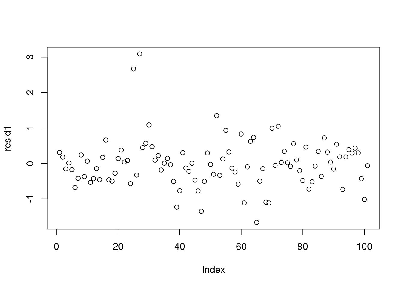
7.1341448 -0.5099636 0.9710936 yhat1 = drop(X %*% pm_params1[1:2])
resid1 = data1_jags$y - yhat1
plot(resid1)- 1
- we are evaluating \hat{y} = b_0 \times 1 + b_1 \times x_1 via matrix multiplication of [1, data1_jags$log_income] *[b_0,b_1]
- 2
- res_i = y_i- \hat y = y_i - (b_0 \times 1 + b_1 \times x_{1,i})
- 3
- plots the residual against the data index
So to get the residuals from Stan we extract the b parameter.
Although we did not discuss it we could estimate \hat y by drawing K predictions for each x_i and look at res_i=\frac{1}{K}\sum_k|y_i -\hat y_{i,k}| and plot upper and fit a line as well as lower and upper bounds as well. Also I’m not sure but I guess we can also do with using the predictive posterior dist. Anyhow here is a link to something like this: Extracting and visualizing tidy residuals from Bayesian models -jk
plot(yhat1, resid1) # against predicted values
qqnorm(resid1) # checking normality of residuals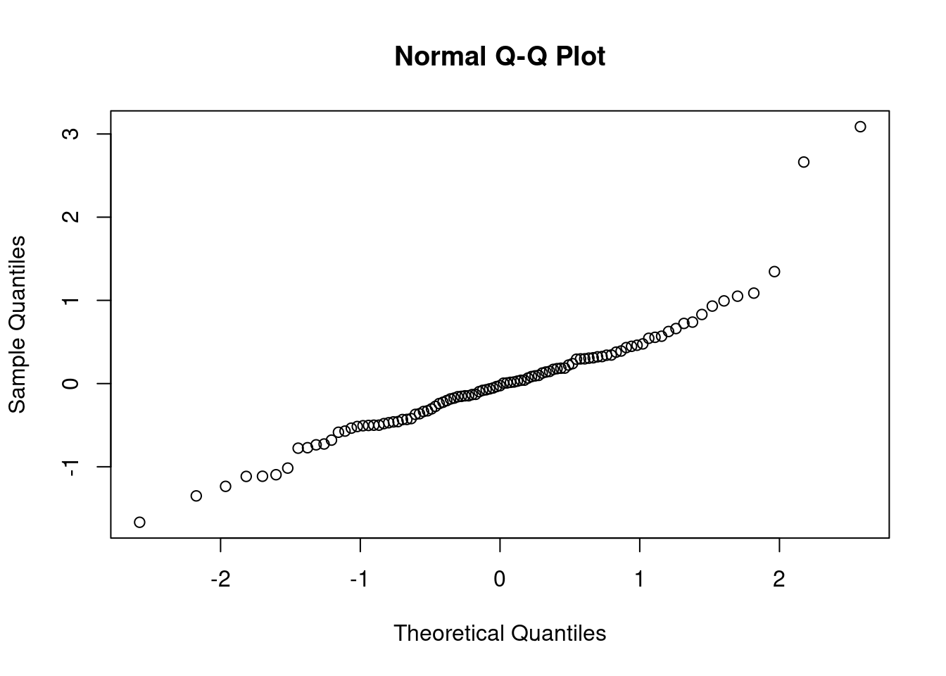
plot(predict(lmod0), resid(mod1)) # to compare with reference linear model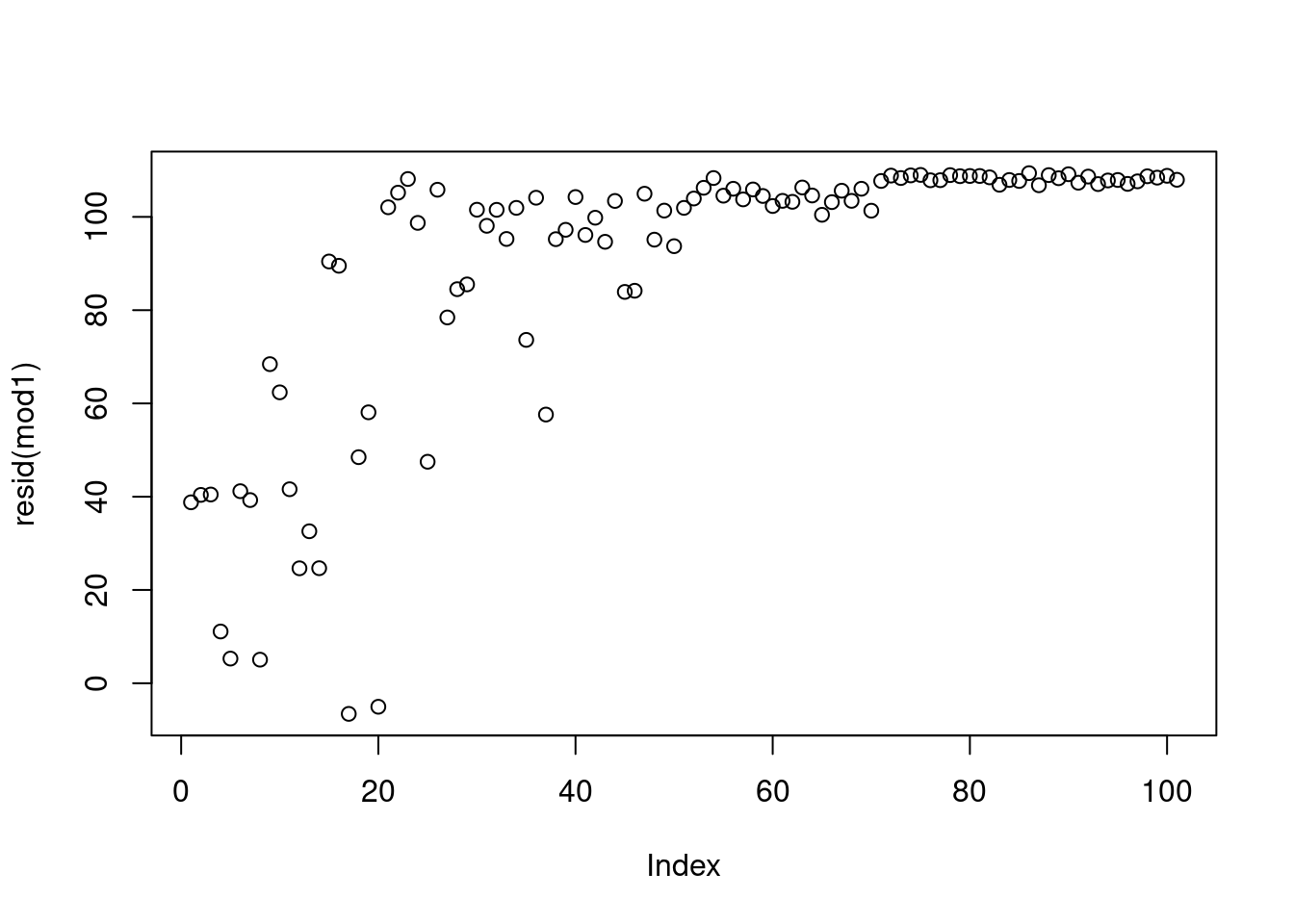
rownames(dat)[order(resid1, decreasing=TRUE)[1:5]] # which countries have the largest positive residuals?[1] "Saudi.Arabia" "Libya" "Zambia" "Brazil" "Afganistan" The residuals look pretty good here (no patterns, shapes) except for two strong outliers, Saudi Arabia and Libya. When outliers appear, it is a good idea to double check that they are not just errors in data entry. If the values are correct, you may reconsider whether these data points really are representative of the data you are trying to model. If you conclude that they are not (for example, they were recorded on different years), you may be able to justify dropping these data points from the data set.
If you conclude that the outliers are part of data and should not be removed, we have several modeling options to accommodate them. We will address these in the next segment.
44 Lesson 7.5 - Alternative models
In the previous segment, we saw two outliers in the model relating the logarithm of infant mortality to the logarithm of income. Here we will discuss options for when we conclude that these outliers belong in the data set.
44.1 Additional covariates
The first approach is to look for additional covariates that may be able to explain the outliers. For example, there could be a number of variables that provide information about infant mortality above and beyond what income provides.
Looking back at our data, there are two variables we haven’t used yet: region and oil. The oil variable indicates oil-exporting countries. Both Saudi Arabia and Libya are oil-exporting countries, so perhaps this might explain part of the anomaly.
library("rjags")
mod2_string = " model {
for (i in 1:length(y)) {
y[i] ~ dnorm(mu[i], prec)
mu[i] = b[1] + b[2]*log_income[i] + b[3]*is_oil[i]
}
for (i in 1:3) {
b[i] ~ dnorm(0.0, 1.0/1.0e6)
}
prec ~ dgamma(5/2.0, 5*10.0/2.0)
sig = sqrt( 1.0 / prec )
} "
set.seed(73)
data2_jags = list(y=dat$loginfant, log_income=dat$logincome,
is_oil=as.numeric(dat$oil=="yes"))
data2_jags$is_oil
params2 = c("b", "sig")
inits2 = function() {
inits = list("b"=rnorm(3,0.0,100.0), "prec"=rgamma(1,1.0,1.0))
}
mod2 = jags.model(textConnection(mod2_string), data=data2_jags, inits=inits2, n.chains=3)
update(mod2, 1e3) # burn-in
mod2_sim = coda.samples(model=mod2,
variable.names=params2,
n.iter=5e3)
mod2_csim = as.mcmc(do.call(rbind, mod2_sim)) # combine multiple chains- 1
- we add the is_oil indicator parameter
- 2
- we increment the number of parameters
- 3
- encode the is_oil from text to be binary
- 4
- draw another var for b.
  [1] 0 0 0 0 0 0 0 0 0 0 0 0 0 0 0 0 0 0 0 0 1 1 1 1 1 1 1 1 0 0 0 0 0 0 0 0 0
 [38] 0 0 0 0 0 0 0 0 0 0 0 0 0 0 0 0 0 0 0 0 0 0 0 0 0 0 0 0 0 0 0 0 0 0 0 0 0
 [75] 0 0 0 0 0 0 0 0 0 0 0 0 0 0 0 0 0 0 0 0 0 0 0 0 0 0 0
Compiling model graph
   Resolving undeclared variables
   Allocating nodes
Graph information:
   Observed stochastic nodes: 101
   Unobserved stochastic nodes: 4
   Total graph size: 507

Initializing model
As usual, check the convergence diagnostics.
par(mar = c(2., 1, 2., 1))
plot(mod2_sim)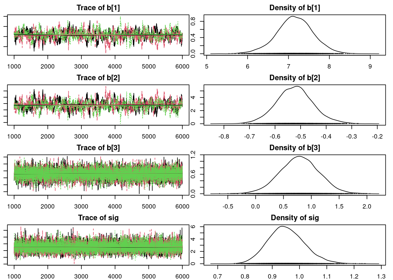
gelman.diag(mod2_sim)Potential scale reduction factors:
Point est. Upper C.I.
b[1] 1.01 1.02
b[2] 1.01 1.02
b[3] 1.00 1.00
sig 1.00 1.00
Multivariate psrf
1.01autocorr.diag(mod2_sim) b[1] b[2] b[3] sig
Lag 0 1.0000000 1.0000000 1.000000000 1.0000000000
Lag 1 0.9478295 0.9483372 0.097033781 0.0408439885
Lag 5 0.7688723 0.7683476 -0.006262866 0.0081239140
Lag 10 0.5887154 0.5880863 0.002533869 -0.0005250436
Lag 50 0.1412149 0.1433086 0.014340618 0.0043753380#autocorr.plot(mod2_sim,auto.layout=FALSE )
autocorr.plot(mod2_csim,auto.layout=FALSE )
effectiveSize(mod2_sim) b[1] b[2] b[3] sig
382.5418 389.7295 11920.3870 12480.7947 We can get a posterior summary of the parameters in our model.
summary(mod2_sim)
Iterations = 1001:6000
Thinning interval = 1
Number of chains = 3
Sample size per chain = 5000

1. Empirical mean and standard deviation for each variable,
   plus standard error of the mean:

        Mean      SD  Naive SE Time-series SE
b[1]  7.1630 0.41785 0.0034117      0.0215450
b[2] -0.5250 0.06796 0.0005549      0.0034782
b[3]  0.7885 0.35020 0.0028593      0.0032107
sig   0.9521 0.06743 0.0005506      0.0006088

2. Quantiles for each variable:

        2.5%     25%     50%     75%   97.5%
b[1]  6.3231  6.8893  7.1693  7.4489  7.9578
b[2] -0.6541 -0.5715 -0.5263 -0.4799 -0.3888
b[3]  0.1025  0.5549  0.7885  1.0235  1.4606
sig   0.8313  0.9049  0.9486  0.9950  1.0940
It looks like there is a positive relationship between oil-production and log-infant mortality. Because these data are merely observational, we cannot say that oil-production causes an increase in infant mortality (indeed that most certainly isn’t the case), but we can say that they are positively correlated.
Now let’s check the residuals.
X2 = cbind(rep(1.0, data1_jags$n), data2_jags$log_income, data2_jags$is_oil)
head(X2)
[,1] [,2] [,3]
[1,] 1 8.139149 0
[2,] 1 8.116716 0
[3,] 1 8.115521 0
[4,] 1 8.466110 0
[5,] 1 8.522976 0
[6,] 1 8.105308 0(pm_params2 = colMeans(mod2_csim)) # posterior mean b[1] b[2] b[3] sig
7.1630386 -0.5249627 0.7884811 0.9521460 yhat2 = drop(X2 %*% pm_params2[1:3])
resid2 = data2_jags$y - yhat2
plot(resid2) # against data index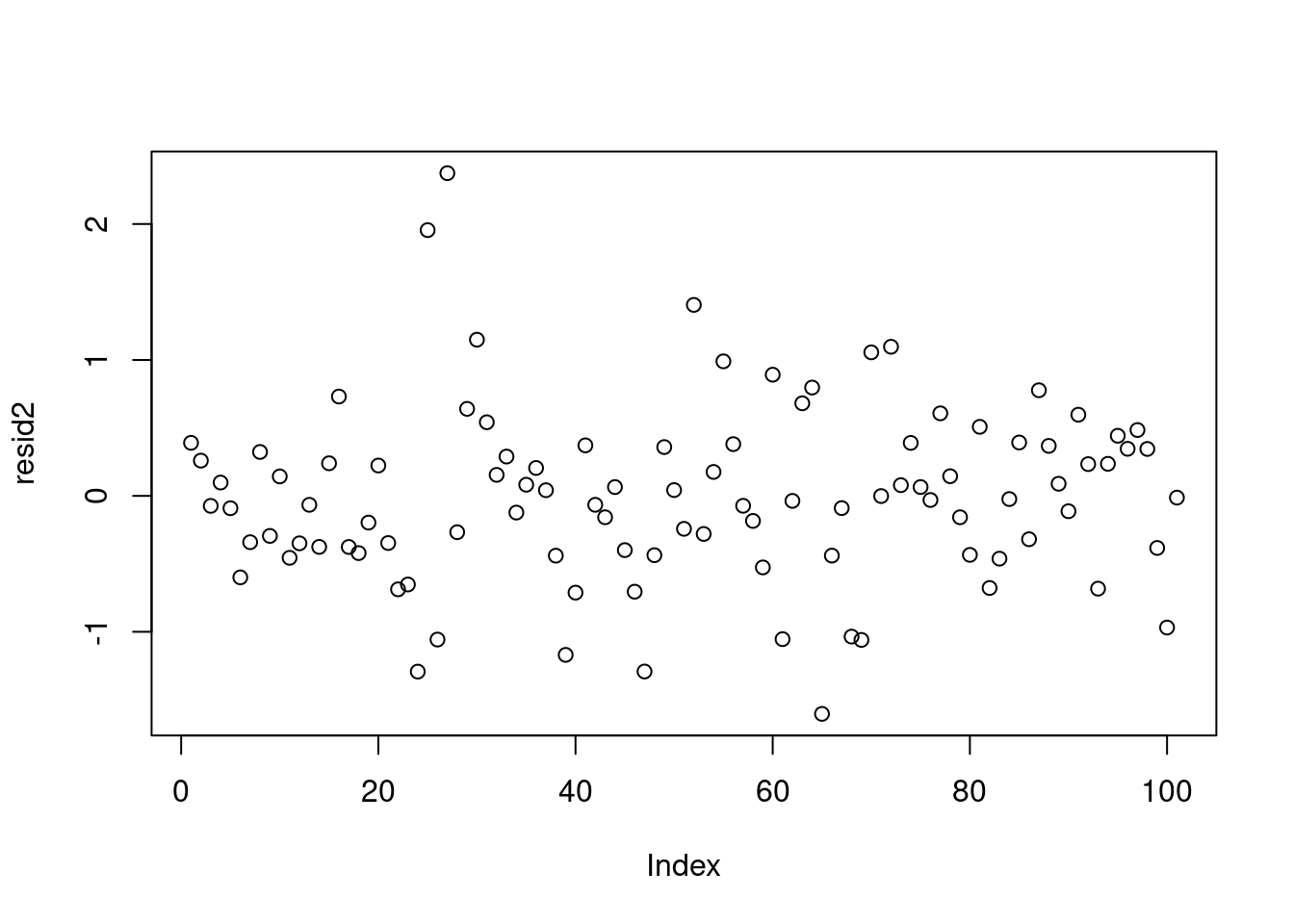
plot(yhat2, resid2) # against predicted values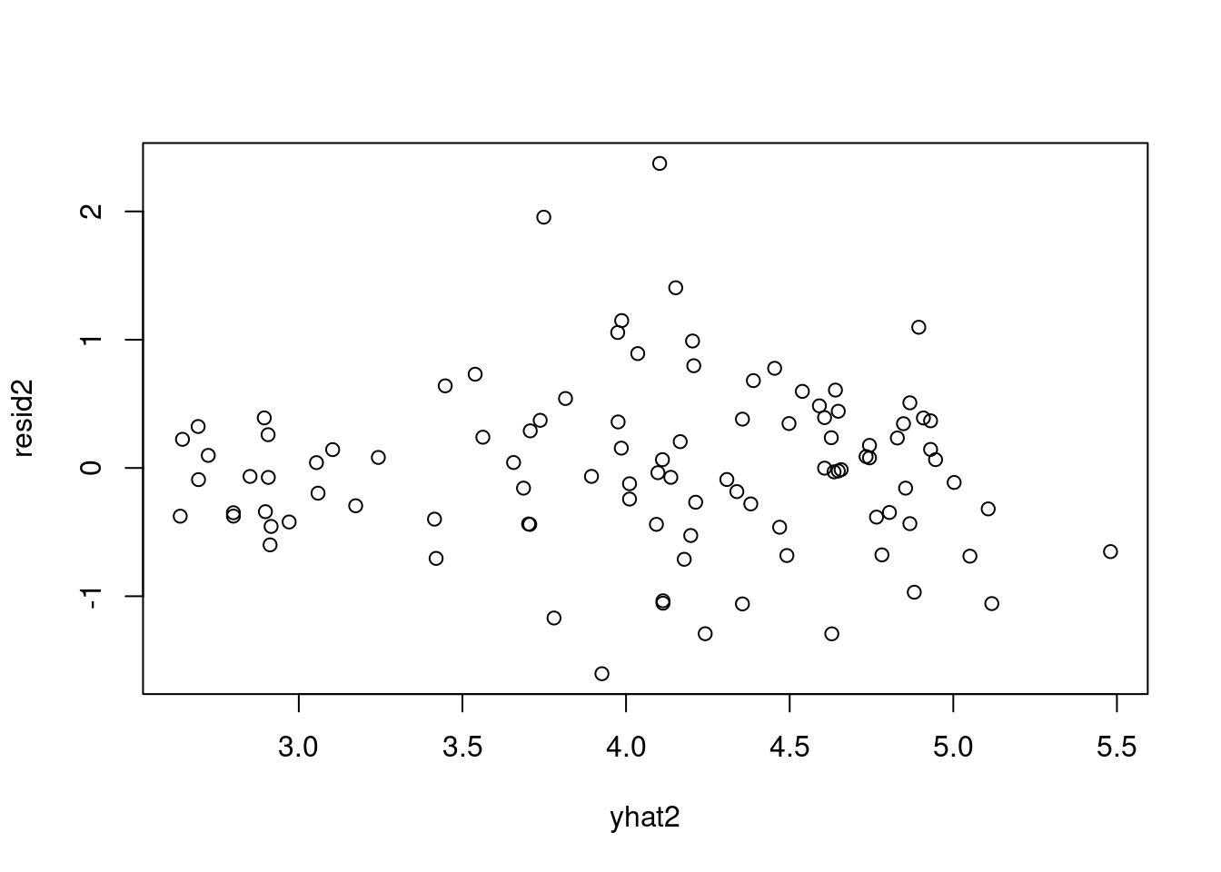
plot(yhat1, resid1) # residuals from the first model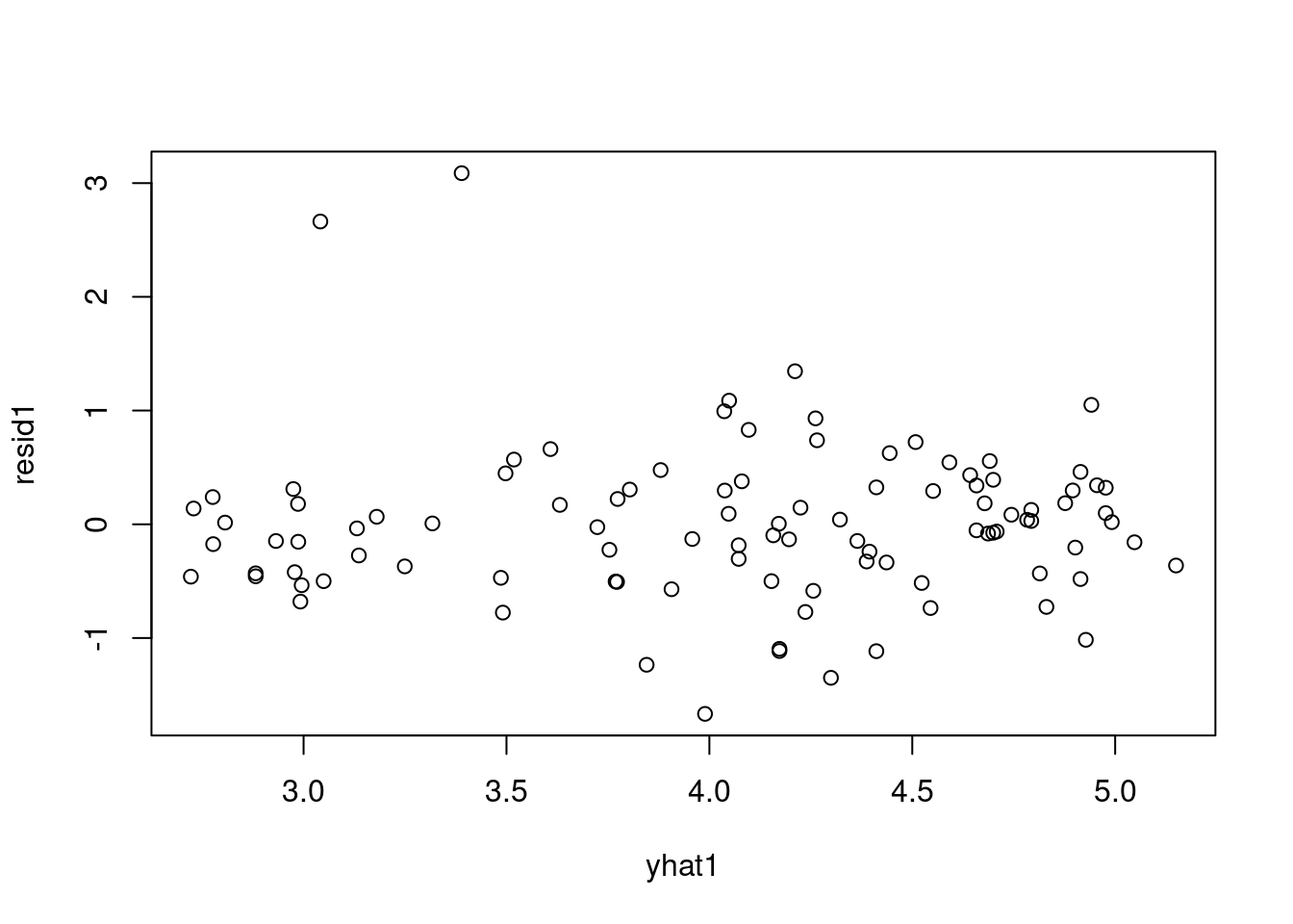
sd(resid2) # standard deviation of residuals[1] 0.6488902These look much better, although the residuals for Saudi Arabia and Libya are still more than three standard deviations away from the mean of the residuals. We might consider adding the other covariate region, but instead let’s look at another option when we are faced with strong outliers.
44.1.1 Student-t likelihood
- Let’s consider changing the likelihood.
- The normal likelihood has thin tails (almost all of the probability is concentrated within the first few standard deviations from the mean).
- This does not accommodate outliers well.
- Consequently, models with the normal likelihood might be overly-influenced by outliers.
- Recall that the t distribution is similar to the normal distribution, but it has thicker tails which can accommodate outliers.
The t linear model might look something like this. Notice that the t distribution has three parameters, including a positive “degrees of freedom” parameter. The smaller the degrees of freedom, the heavier the tails of the distribution. We might fix the degrees of freedom to some number, or we can assign it a prior distribution.
curve(dnorm(x), from = -5, to = 5)
curve(dt(x,1), from = -5, to = 5,col="red", add = TRUE)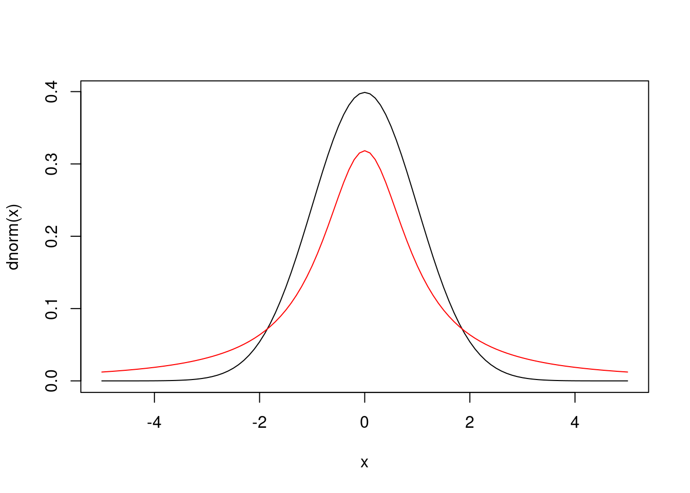
mod3_string = " model {
for (i in 1:length(y)) {
y[i] ~ dt( mu[i], tau, df )
mu[i] = b[1] + b[2]*log_income[i] + b[3]*is_oil[i]
}
for (i in 1:3) {
b[i] ~ dnorm(0.0, 1.0/1.0e6)
}
nu ~ dexp(1.0)
df = nu + 2.0
tau ~ dgamma(5/2.0, 5*10.0/2.0)
sig = sqrt( 1.0 / tau * df / (df - 2.0) )
}"- 1
- we replaced normal likelihood with a student t likelihood which has thicker tails
- 2
-
\nu
nuis the degrees of freedom (dof) but the outcome can be 0 or 1 - 3
-
we force the degrees of freedom
dof>2to guarantee the existence of mean and variance in the t dist. - 4
-
\tau
tauis the inverse scale is close to, but not equal to the precision from above so we use the same prior as we used for precision. - 5
-
\sigma
sigstandard deviation of errors is a deterministic function oftau, anddf
We fit this model.
set.seed(73)
data3_jags = list(y=dat$loginfant, log_income=dat$logincome,
                  is_oil=as.numeric(dat$oil=="yes"))

params3 = c("b", "sig")

inits3 = function() {
    inits = list("b"=rnorm(3,0.0,100.0), "prec"=rgamma(1,1.0,1.0))
}

mod3 = jags.model(textConnection(mod3_string), data=data3_jags, inits=inits3, n.chains=3)
update(mod3, 1e3) # burn-in

mod3_sim = coda.samples(model=mod3,
                        variable.names=params3,
                        n.iter=5e3)

mod3_csim = as.mcmc(do.call(rbind, mod3_sim)) # combine multiple chains
Compiling model graph
Resolving undeclared variables
Allocating nodes
Graph information:
Observed stochastic nodes: 101
Unobserved stochastic nodes: 5
Total graph size: 512
Initializing modelcheck MCMC convergence visually
par(mar = c(2.5, 1, 2.5, 1))
plot(mod3_sim)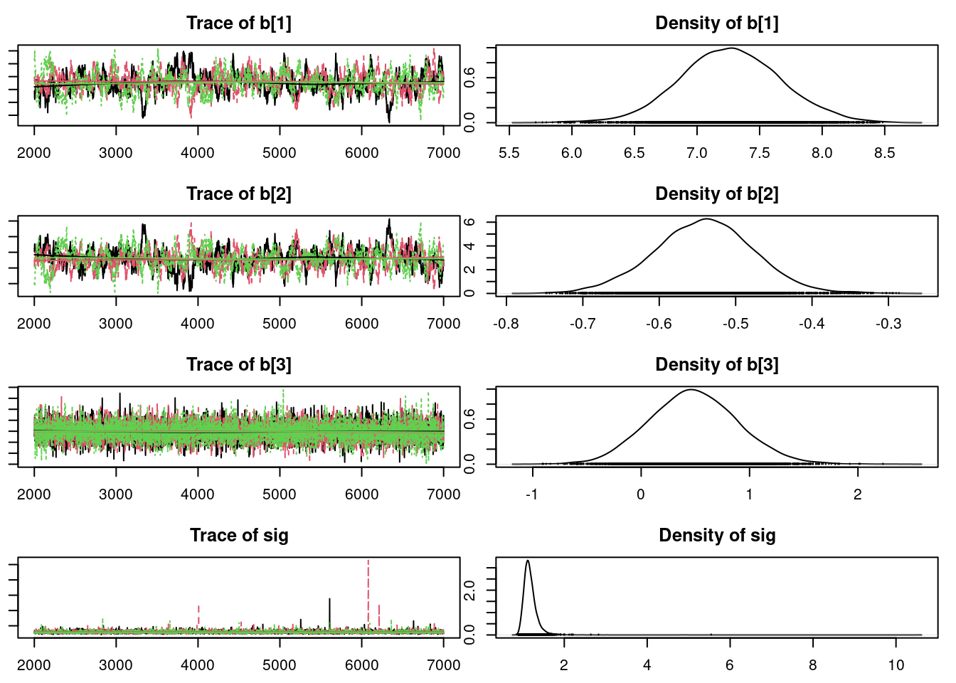
check MCMC convergence quantitatively using Rubin Gelman
gelman.diag(mod3_sim)Potential scale reduction factors:
Point est. Upper C.I.
b[1] 1.02 1.06
b[2] 1.02 1.05
b[3] 1.00 1.00
sig 1.00 1.01
Multivariate psrf
1.01effectiveSize(mod3_sim) b[1] b[2] b[3] sig
276.6437 271.9059 8318.1047 8919.7432 44.2 Compare models using Deviance information criterion (DIC)
We have now proposed three different models. How do we compare their performance on our data? In the previous course, we discussed estimating parameters in models using the maximum likelihood method. Similarly, we can choose between competing models using the same idea.
We will use a quantity known as the deviance information criterion (DIC). It essentially calculates the posterior mean of the log-likelihood and adds a penalty for model complexity.
Let’s calculate the DIC for our first two models:
the simple linear regression on log-income,
dic.samples(mod1, n.iter=1e3)Mean deviance: 230.9
penalty 2.726
Penalized deviance: 233.6 and the second model where we add oil production.
dic.samples(mod2, n.iter=1e3)Mean deviance: 225.4
penalty 4.113
Penalized deviance: 229.5 and the second model where we introduce the Student t likelihood.
dic.samples(mod3, n.iter=1e3)Mean deviance: 230.7
penalty 3.546
Penalized deviance: 234.3 The first number is the Monte Carlo estimated posterior mean deviance, which equals -2 times the log-likelihood (plus a constant that will be irrelevant for comparing models). Because of that -2 factor, a smaller deviance means a higher likelihood.
Next, we are given a penalty for the complexity of our model. This penalty is necessary because we can always increase the likelihood of the model by making it more complex to fit the data exactly. We don’t want to do this because over-fit models generalize poorly. This penalty is roughly equal to the effective number of parameters in your model. You can see this here. With the first model, we had a variance parameter and two betas, for a total of three parameters. In the second model, we added one more beta for the oil effect.
We add these two quantities to get the DIC (the last number). The better-fitting model has a lower DIC value. In this case, the gains we receive in deviance by adding the is_oil covariate outweigh the penalty for adding an extra parameter. The final DIC for the second model is lower than for the first, so we would prefer using the second model.
We encourage you to explore different model specifications and compare their fit to the data using DIC. Wikipedia provides a good introduction to DIC and we can find more details about the JAGS implementation through the rjags package documentation by entering ?dic.samples in the R console.
#?dic.samples44.3 Regression Diagnostics
In production we want to flag regression issues in an automated fashion. However while we develop models we should try to examine these issues visually.
Regression diagnostics help identify:
- shortcoming of our model and the preferred ways to improve them
- transforms of variables
- different likelihood
- adding missing covariate relations to remove patterns in the residuals
- increasing interpretability by removing covariates that do not contribute to the fit.
- issues in the data
- transformation
we should consider the following issues: 1. testing heteroscedasticity with the Breusch-Pagan test
Let’s try to cover the diagnostic plots which help us validate a regression model.
44.3.1 Residuals v.s. Fitted
The “residuals versus fits plot” is the most first diagnostic tool we should look at to determine if the regression is valid. If the regression assumptions are violated we should be able to identify the issues and possibly correct them.
It is a scatter plot of residuals on the y axis and fitted values (estimated responses) on the x axis.
The plot can be used to detect:
- non-linearity,
- unequal error variances, and
- outliers.
plot(lmod0, 1)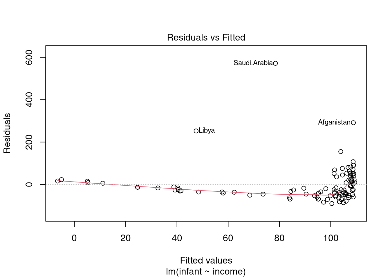
Residuals will enable us to assess visually whether an appropriate model has been fit to the data no matter how many predictor variables are used. We can checking the validity of a linear regression model by plotting residuals versus x and look for patterns. - Lack of a discernible pattern is indicative of a valid model. - A pattern is is indicative that a function or transformation of X is missing from the model.
ImportantWhat to look for
Look for patterns that can indicate non-linearity,
- that the residuals all are high in some areas and low in others. Change in variability as X changes - U shape missing quadratic term · we can get this plot as follows.
The blue line is there to aid the eye - it should ideally be relatively close to a straight line (in this case, it isn’t perfectly straight, which could indicate a mild non-linearity).
44.3.2 QQ plot of the residuals
This plot shows if residuals are normally distributed. Do residuals follow a straight line well or do they deviate severely?
The regression is valid if the residuals are lined well on the straight dashed line.
we can get this plot as follows
plot(lmod0, 2)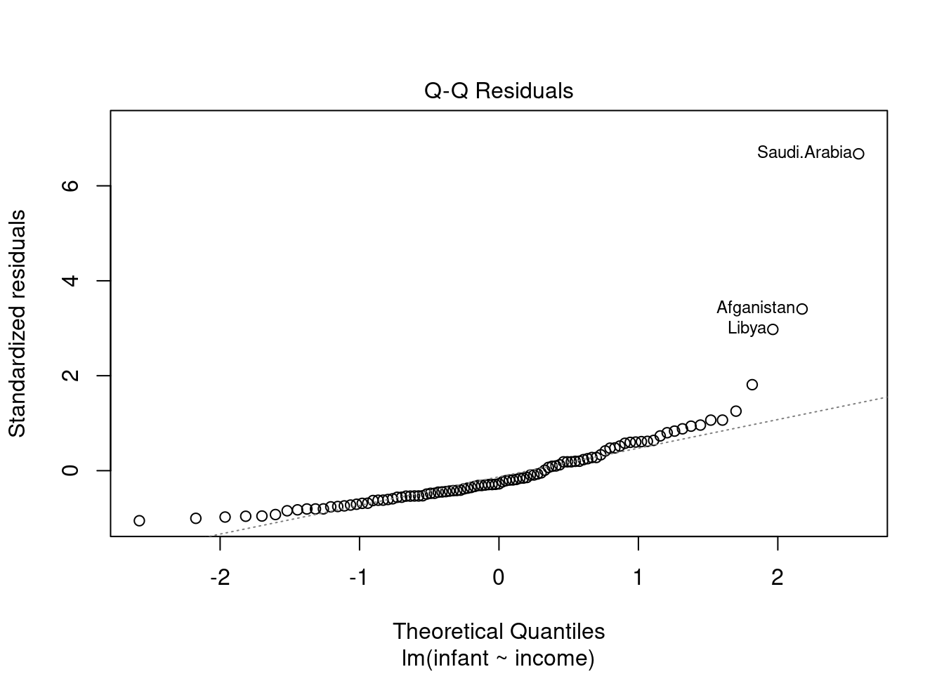
notice that the two outliers are labeled and should be reviewed for - removal - more robust likelihood
for more info see understanding QQ plots
44.3.3 Scale Location plot
This plot shows if residuals are spread equally along the ranges of predictors. This is how you can check the assumption of equal variance (homoscedasticity). It’s good if you see a horizontal line with equally (randomly) spread points.
plot(lmod0, 3)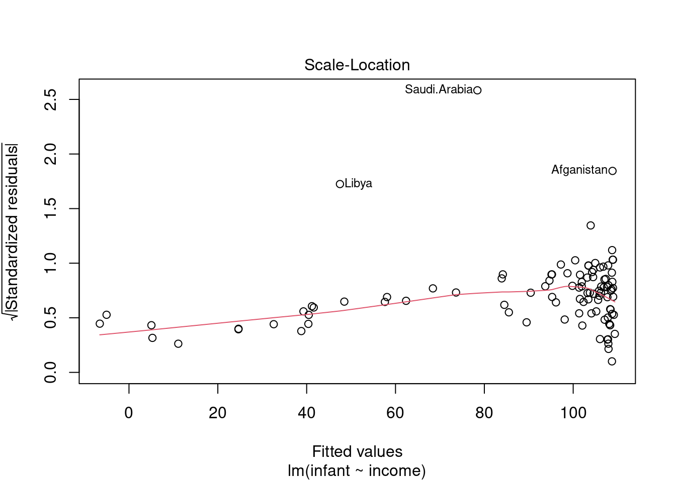
in this case: - most of the points are to the right - the red line is almost flat which is good - there is increasing variance after 80
44.3.4 Cook’s Distance
- Originally introduced in (Cook 1977) Cook’s Distance is an estimate of the influence of a data point. - It takes into account both the leverage and residual of each observation. - Cook’s Distance is a summary of how much a regression model changes when the ith observation is removed. - When it comes to outliers we care about outliers that have a high Cook’s distance as they can have a large impact on the regression model. by shifting the sample fit from the population fit. - Another aspect of Cook’s distance is it can be used to identify regions of the design space where the model is poorly supported by the data - i.e. where the model is extrapolating and if we can get more data in that region we can improve the model.
plot(lmod0, 4)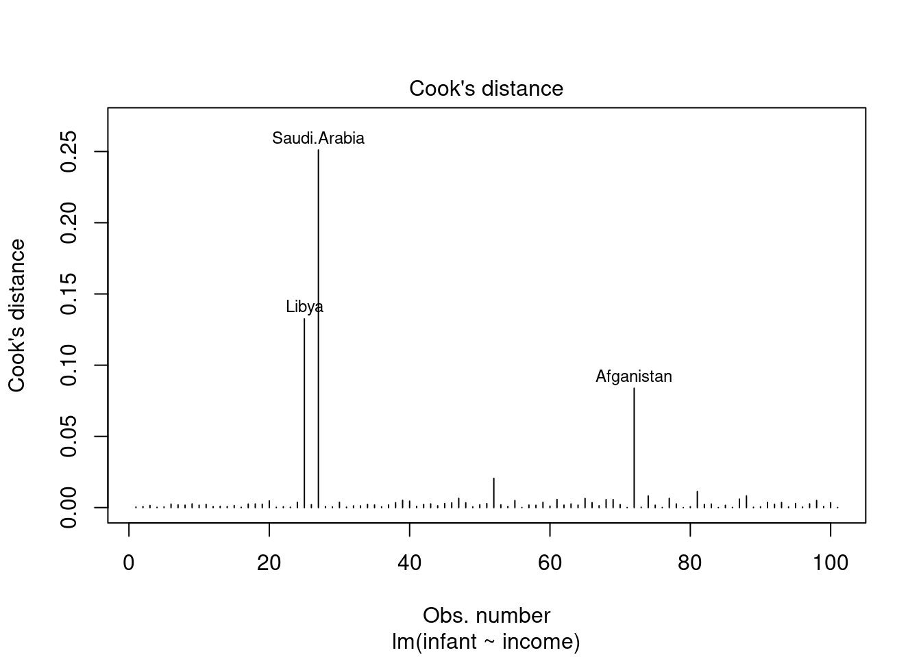
Used to detect highly influential outliers, i.e. points that can shift the sample fit from the population fit. For large sample sizes, a rough guideline is to consider values above 4/(n-p), where n is the sample size and p is the number of predictors including the intercept, to indicate highly influential points.
see Williams (1987)
44.3.5 Residuals vs Leverage
plot(lmod0, 5)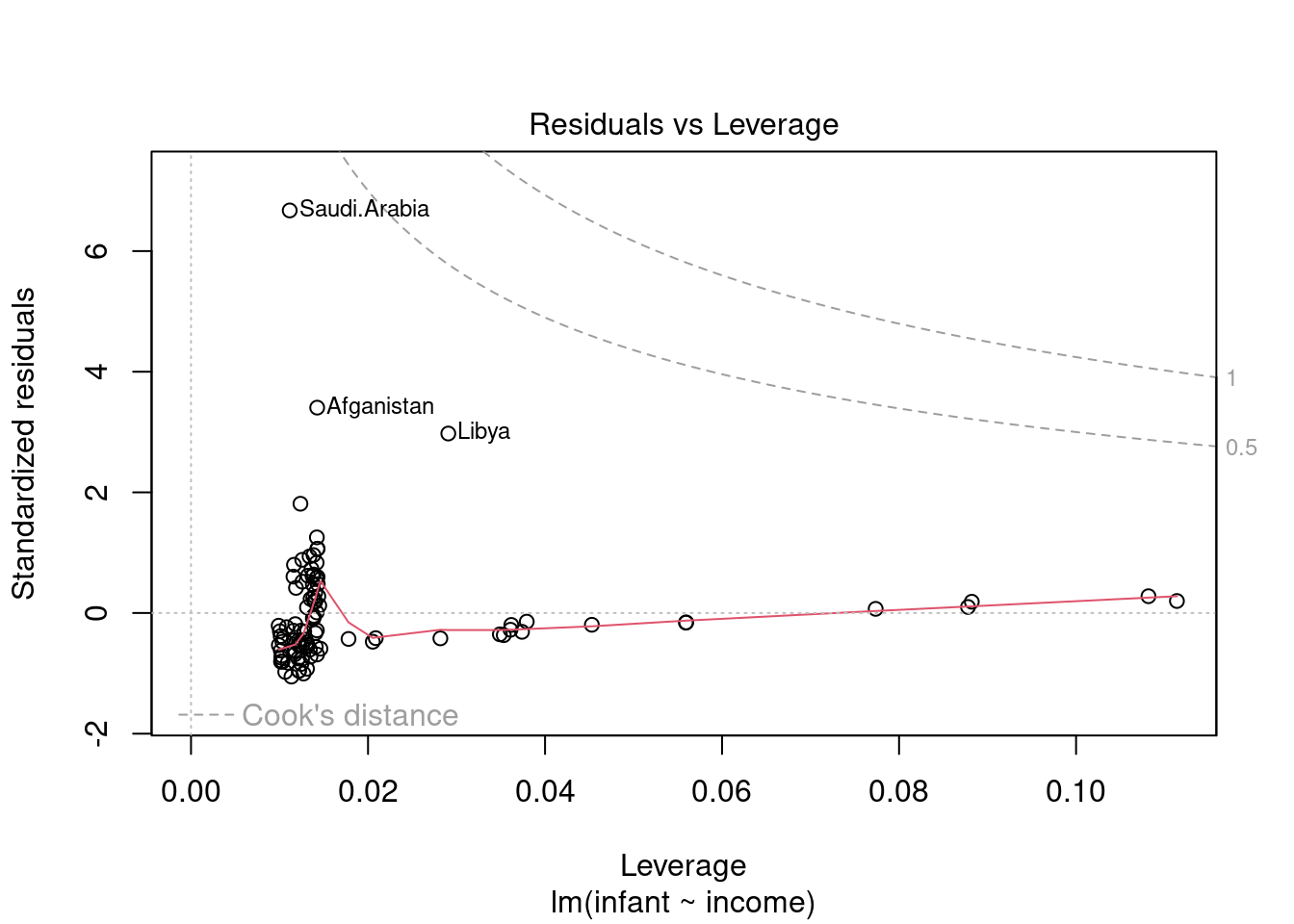
#plot(mod3, 5)This plot helps us to sort through the outliers, if there are any. Not all outliers are influential in linear regression analysis. Even though data have extreme values, they might not be influential to determine a regression line. i.e. the fit wouldn’t be much different if we choose to omit them from the analysis. If a point is able to exert a influence on the regression line we call it a high leverage point. Even in this case it might not alter the trend. So we want to identify high leverage points that are at a large distance from their predictor’s mean.
Unlike the other plots, this time patterns are not relevant. We watch out for outlying values at the upper right corner or at the lower right corner. Those spots are the places where cases can be influential against a regression line. Look for cases outside of the dashed lines. When cases are outside of the dashed lines (meaning they have high “Cook’s distance” scores), the cases are influential to the regression results. The regression results will be altered if we exclude those cases.
In this case we see that the pints are within the cook’s distance contours so our outliers are not high leverage points.
44.3.6 Cook’s Distance vs Leverage
plot(lmod0, 6)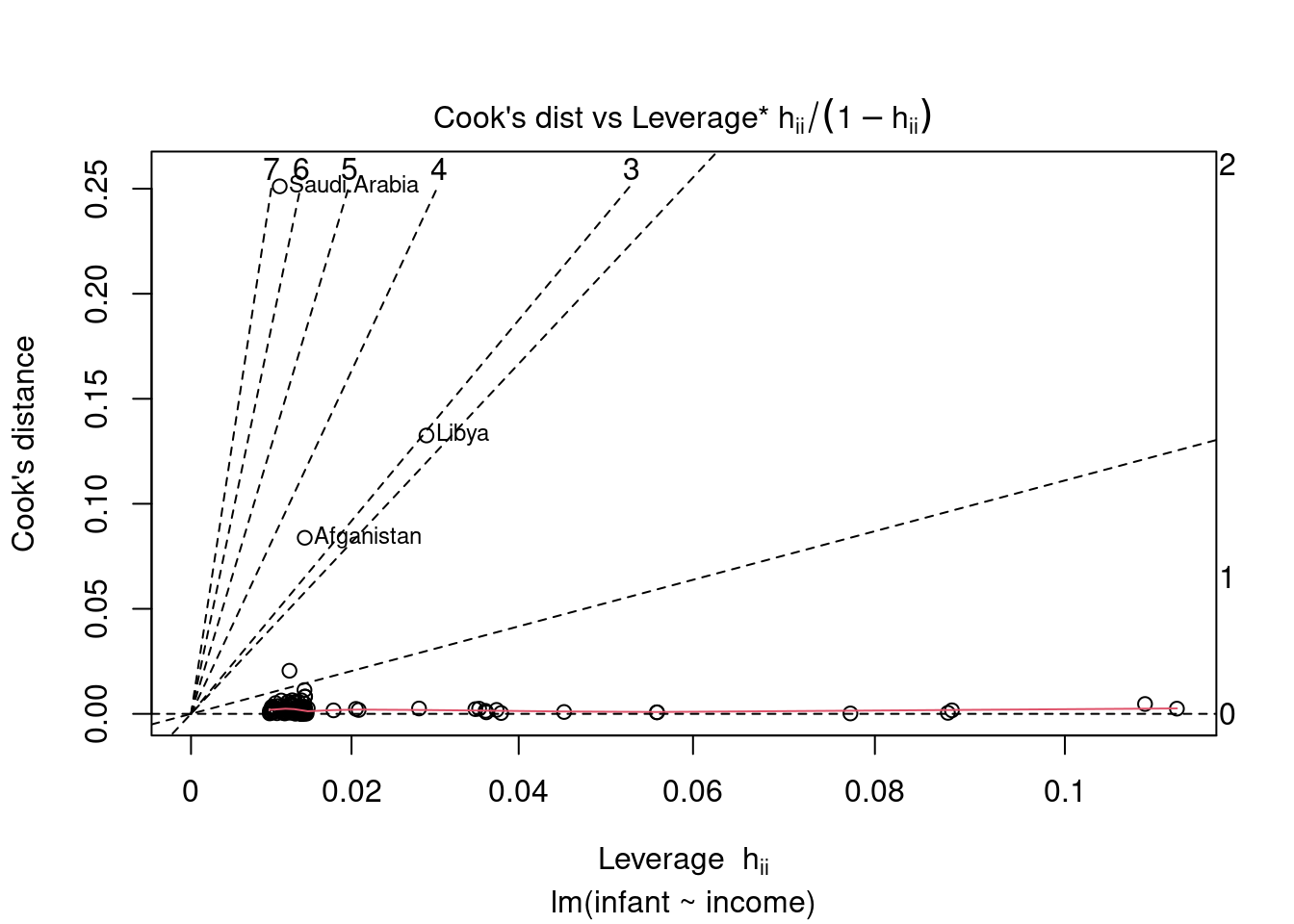
Cook’s distance and leverage are used to detect highly leverage points, i.e. data points that can shift the sample fit from the population fit.
For large sample sizes, a rough guideline is to consider Cook’s distance values above 1 to indicate highly influential points and leverage values greater than 2 times the number of predictors divided by the sample size to indicate high leverage observations. High leverage observations are ones which have predictor values very far from their averages, which can greatly influence the fitted model.
The contours in the scatterplot are standardized residuals labelled with their magnitudes
see Williams (1987)
44.3.7 Python
- https://emredjan.xyz/blog/2017/07/11/emulating-r-plots-in-python/
- https://towardsdatascience.com/going-from-r-to-python-linear-regression-diagnostic-plots-144d1c4aa5a
- https://modernstatisticswithr.com/regression.html