Introduction, Statistical Learning, ISL, ESL, Statistical Learning vs Machine Learning
Figure 1: Opening Remarks
Figure 2: Examples and Framework
TL;DR - Introduction
Statistical Learning in a nutshell
Statistical learning is a set of tools for understanding data and building models that can be used for prediction or inference. The fundamental goal is to learn a function (f) that captures the relationship between input variables (predictors) and an output variable (response). This learned function can then be used to make predictions for new observations or for inference i.e. to understand the underlying relationship between the variables.
This chapter is a bit dull. The authors make significant effort to breathe life into it in the course via the talks. But humor and jokes aside. Most of the examples and datasets from the book and make them sound mildly interesting, but my impression of the advertising data and a few others is that this is just data and that they never worked for an advertising company where most of the questions raised are quite divergent to the ones considered in the book. I think that by getting the younger authors to participate we get a better sense of why Statistical learning is more interesting.
IBM’s Watson beating the Jeopardy champions was exciting before the advent of LLMs. In reality IBM poured lots of resources into this demonstration of being able to beat some poor humans with a massive database of trivia. Later IBM had a very big headache trying to sell Watson to companies. IT took 10 years for LLM assistant to become both useful and in scale. If we consider the slide from the video we would notice that the project description is indicating the use of reinforcement learning and not statistical learning or ml methods and this is not covered in the book. However the authors do suggests that many methods were used to create Watson and that sounds about true.
Nates Silver wrote “The signal and the noise”. Its a well written and fun to read. I think that we can all take lessons from it on how to breathe more life into statistics.
Another story they mention is Nate Silver’s Five Thirty Eight site for prediction of the presidential and other elections. I find it amusing they mention this as Nate Silver is not a statistician. In reality most people use statistics as a tool to get their job done and are not full time statisticians. I agree that Nate Silver is a “rock star” of statistics. It’s worth mentioning though that predicting elections is isn’t hard mathematically - the challenge is getting the details right and Nate Silver is good at that and thus deserves a lot of respect.
There is fascinating work by Andrew Gelman and John Tukey before on this topic. In fact John Tukey like Silver gained a lot of recognition, not from his amazing work on EDA, including the boxplot, the JAckknife the Fast Fourier Transform, designing spy planes, naming the bit and software but for running election polls on NBC from 1960 to 1980. And a final point is that the best models as far as I know are using Bayesian methods which are not covered in this book to any great detail.
Statistical Learning Problems
Identify the risk factors for prostate cancer.
Classify a recorded phoneme based on a log-periodogram.
Predict whether someone will have a heart attack on the basis of demographic, diet and clinical measurements.
Customize an email spam detection system.
Identify the numbers in a handwritten zip code.
Classify a tissue sample into one of several cancer classes, based on a gene expression profile.
Establish the relationship between salary and demographic variables in population survey data.
Classify the pixels in a LANDSAT image, by usage.
Identify the risk factors for prostate cancer
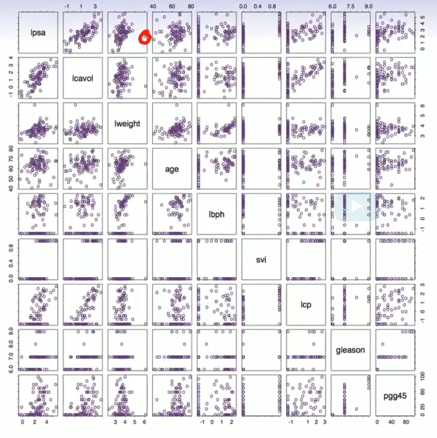
SPLOM
This is the first example but we have a few issues:
Our instructors seem to be familiar with the researcher but they don’t tell what is going on at first. It would only take 3 minutes to explain the variables but they don’t bother to do so. If they did this example might make more sense.
IS this a regression, classification, survival analysis, an annova, a clustering problem?
So Trevor tells us it is a regression problem and the response is PSA
Github co-pilot suggest that the predictors and response are:
the log of the prostate specific antigen (lpsa).
lcavol - log cancer volume
lweight - log prostate weight
age
lbph - log of the amount of benign prostatic hyperplasia. aka enlargement of the prostate that is not cancerous but has many issues for the patient.
svi - seminal vesicle invasion which is a measure of how far the cancer has spread and an indicator that the patient is unlikely to survive.
pgg45 - a measure of how aggressive the cancer is.
They say that these are people with cancer so they are sick. Dr. Google says 80% should survive 10 years or more.
How long was the study.
Is there any data on severity of the cancer? (lcavol and svi are indicators of severity)
But do we have data for a control group? Are there any data for healthy people here?
Ever I first learned about them I really, really love scatter plot matrix - I mean you can immediately see the effects and diagnose problems right?
There are 64/2 = 32 effects to look at. But we really need to consider the predictors vs the response. Where those 8 plots? According to Trevor there are the top 8 plots.
lpsa vs lcavol seems linear.
lpsa vs lweight seems affine and heteroskedastic. But might look better if we dropped the outlier.- lpsa vs. age seems like a linear relationship with high variance. Or there may be clusters.
lpsa vs. lbph looks zero inflated or censored. I mean much of the data is squished to the left.
The log scale is hard to interpret what is -1 for lbph?
Should we be alarmed if the plot shows the two predictors with this pattern.
What if we see this for a predictor and the response?
Except that:
The scales are there but on the side but they alternate, left right, or up and down. The two labels are also far away easy to misinterpret . So it is not easy to tell at a glance what you are looking at.
Eveything is shown twice. And what is worse if you look above or bellow the diagonal the axis are flipped.
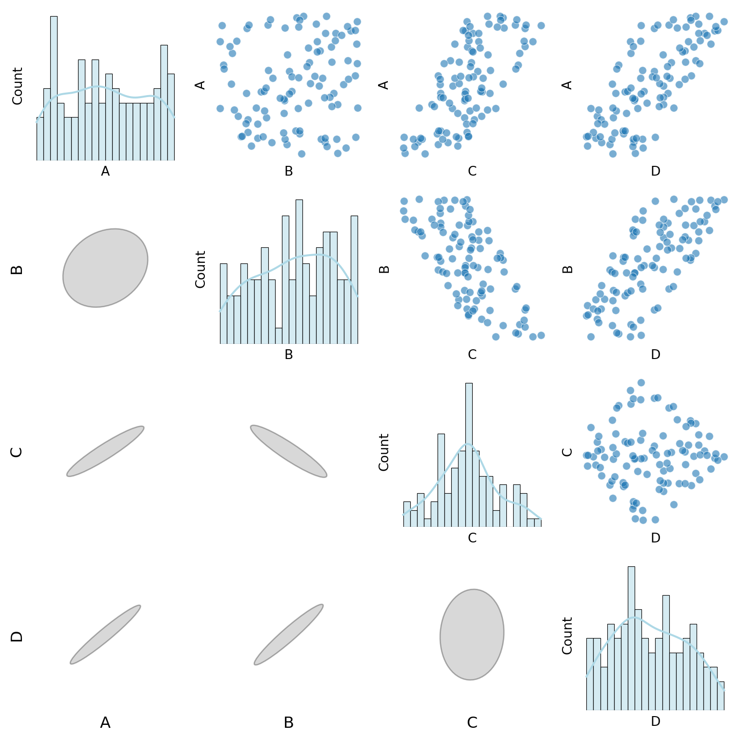
I prefer to plot something different below to avoid this issue and I like the ellipses form of a corellogram. But this is easier in R I don’t think I quite got it right in Python.
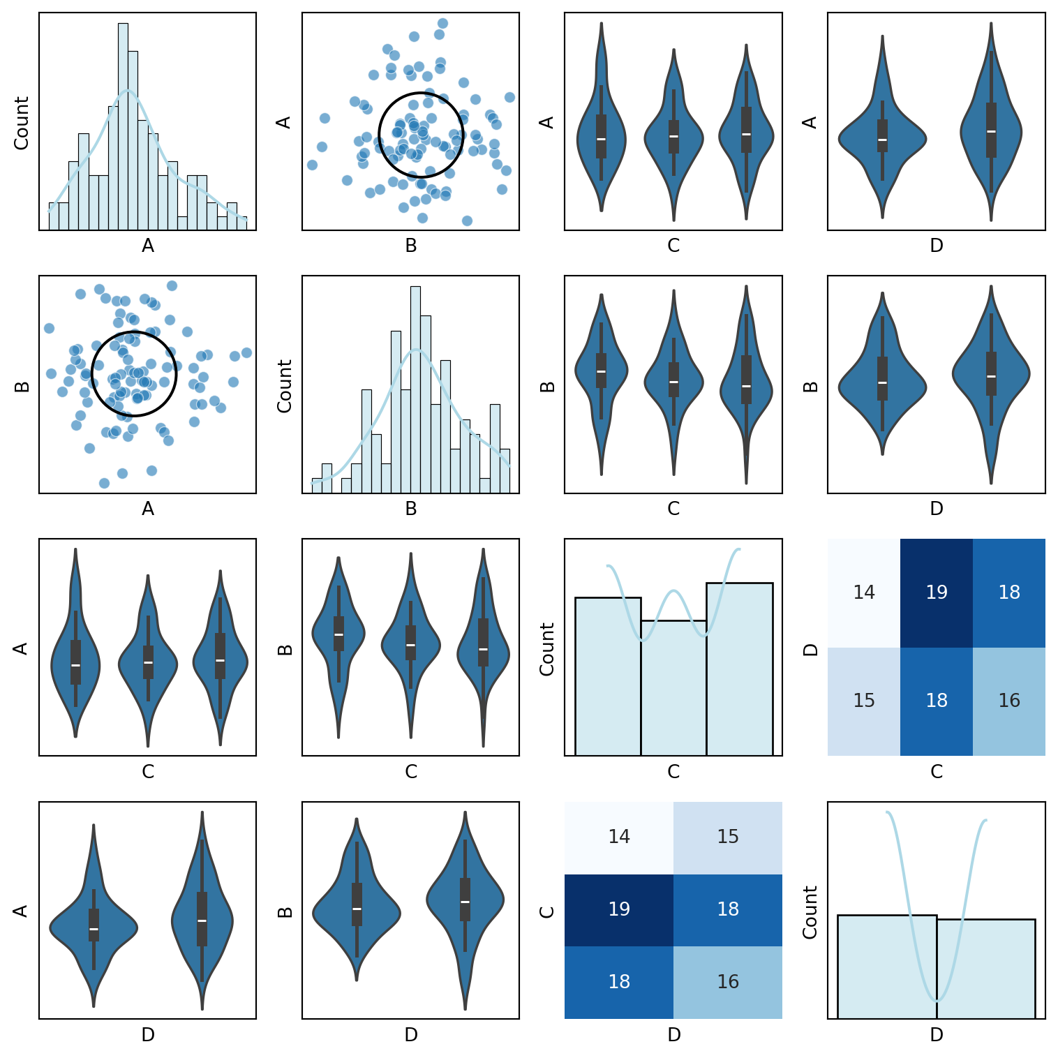
For binary and categorical variables it’s the scatter plot is pretty uninformative. And more so when you plot two categorical predictors against each other since the plot lines them up on top of each other. What I like to do us use a violin plot or a box plot.
This plot features nine variables and already hard to make sense of.
I spent some time as an analyst and this got me used to segmenting things. It’s easy to segment SPLOMs and show lots of interesting relations in one big chart but it a challenge to make sense of and the big point being made is that we should take the time to look at the data.
Notice that the massive outlier is very easy to miss. Perhaps we might want to indicate potential outliers/etc in a way that stands out more?
But it would be even better if we could interactively zoom into two of the charts and examine them in tandem.
Trevor Hastie also show us a log transformed version. It seems to be better except that most of the data is already log transformed. So if he advocating for a double log transform. It can help to find so called supper outliers called black swans by Nassim Taleb. But in this case it seems to be a mistake. On the other hand perhaps he showed us the inverse of the log transform which might make more sense. It not clear what he did!-
import numpy as npimport pandas as pdimport seaborn as snsimport matplotlib.pyplot as pltfrom matplotlib.patches import Ellipsefrom sklearn.preprocessing import LabelEncoderdef correlation_ellipse(ax, x, y, data, **kwargs):"""Plot correlation ellipses like R's circles package.""" cov = np.cov(data[x], data[y]) eigvals, eigvecs = np.linalg.eig(cov) angle = np.degrees(np.arctan2(*eigvecs[:, 0][::-1])) ellipse = Ellipse( xy=(data[x].mean(), data[y].mean()), width=2* np.sqrt(eigvals[0]), height=2* np.sqrt(eigvals[1]), angle=angle, edgecolor='black', facecolor='none', linewidth=1.5 ) ax.add_patch(ellipse)def custom_pair_plot(df):"""Generate a pair plot with scatter plots for continuous variables, violin plots for discrete variables, and correlation ellipses.""" continuous_vars = df.select_dtypes(include=['float64', 'int64']).columns discrete_vars = df.select_dtypes(include=['object', 'category']).columns label_encoders = {col: LabelEncoder().fit(df[col]) for col in discrete_vars} df_encoded = df.copy()# Encode categorical variablesfor col in discrete_vars: df_encoded[col] = label_encoders[col].transform(df[col]) num_vars = df_encoded.shape[1] fig, axes = plt.subplots(num_vars, num_vars, figsize=(2*num_vars, 2*num_vars))for i, var1 inenumerate(df_encoded.columns):for j, var2 inenumerate(df_encoded.columns): ax = axes[i, j]if i == j: sns.histplot(df[var1], ax=ax, kde=True, bins=20, color="lightblue")elif var1 in continuous_vars and var2 in continuous_vars: sns.scatterplot(x=df[var2], y=df[var1], ax=ax, alpha=0.6) correlation_ellipse(ax, var2, var1, df_encoded)elif var1 in discrete_vars and var2 in continuous_vars: sns.violinplot(x=df[var1], y=df[var2], ax=ax)elif var1 in continuous_vars and var2 in discrete_vars: sns.violinplot(x=df[var2], y=df[var1], ax=ax)else: sns.heatmap(pd.crosstab(df[var2], df[var1]), annot=True, fmt="d", cmap="Blues", ax=ax, cbar=False) ax.set_xticks([]) ax.set_yticks([]) plt.tight_layout() plt.show()# Example usagedf = pd.DataFrame({'A': np.random.randn(100),'B': np.random.randn(100) *2,'C': np.random.choice(['Low', 'Medium', 'High'], 100),'D': np.random.choice(['Yes', 'No'], 100)})custom_pair_plot(df)
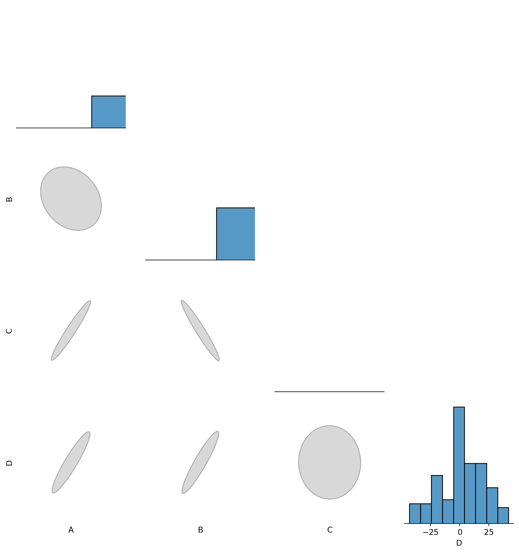
import numpy as npimport pandas as pdimport seaborn as snsimport matplotlib.pyplot as pltfrom matplotlib.patches import Ellipsefrom sklearn.preprocessing import LabelEncoder, MinMaxScalerdef correlation_ellipse(ax, x, y, data, max_size=1.2):"""Plot a properly scaled correlation ellipse in the lower triangle.""" x_vals = data[x] y_vals = data[y] corr = np.corrcoef(x_vals, y_vals)[0, 1] # Pearson correlation cov = np.cov(x_vals, y_vals) eigvals, eigvecs = np.linalg.eig(cov)# Normalize eigenvalues to ensure uniform ellipse size max_eigenvalue = np.max(eigvals) width, height = max_size * (eigvals / max_eigenvalue) # Scale within a fixed box angle = np.degrees(np.arctan2(*eigvecs[:, 0][::-1])) ellipse = Ellipse( xy=(0, 0), # Centered at (0,0) since we scale manually width=width, height=height, angle=angle, edgecolor='black', facecolor='gray', alpha=0.3 ) ax.add_patch(ellipse)# Fix axis limits to keep all ellipses inside a square ax.set_xlim(-1, 1) ax.set_ylim(-1, 1) ax.set_xticks([]) ax.set_yticks([]) ax.set_frame_on(False) # Remove frame for claritydef custom_pair_plot(df):"""Generate a pair plot where: - Histograms appear on the diagonal. - Scatter & Violin plots are in the upper triangle. - Normalized correlation ellipses appear in the lower triangle. - Labels for the bottom and left axes of ellipses. """ continuous_vars = df.select_dtypes(include=['float64', 'int64']).columns discrete_vars = df.select_dtypes(include=['object', 'category']).columns# Normalize all continuous variables to [0,1] for consistent ellipses scaler = MinMaxScaler() df_encoded = df.copy() df_encoded[continuous_vars] = scaler.fit_transform(df[continuous_vars])# Encode categorical variables label_encoders = {col: LabelEncoder().fit(df[col]) for col in discrete_vars}for col in discrete_vars: df_encoded[col] = label_encoders[col].transform(df[col]) num_vars =len(df_encoded.columns) fig, axes = plt.subplots(num_vars, num_vars, figsize=(2*num_vars, 2*num_vars))for i, var1 inenumerate(df_encoded.columns):for j, var2 inenumerate(df_encoded.columns): ax = axes[i, j]# Diagonal: Histogramsif i == j: sns.histplot(df[var1], ax=ax, kde=True, bins=20, color="lightblue")# Above diagonal: Scatter & Violin plotselif i < j:if var1 in continuous_vars and var2 in continuous_vars: sns.scatterplot(x=df[var2], y=df[var1], ax=ax, alpha=0.6)elif var1 in discrete_vars and var2 in continuous_vars: sns.violinplot(x=df[var1], y=df[var2], ax=ax)elif var1 in continuous_vars and var2 in discrete_vars: sns.violinplot(x=df[var2], y=df[var1], ax=ax)else: sns.heatmap(pd.crosstab(df[var2], df[var1]), annot=True, fmt="d", cmap="Blues", ax=ax, cbar=False)# Below diagonal: Correlation ellipseselse: correlation_ellipse(ax, var2, var1, df_encoded)# Add axis labels for the bottom row and left-most columnif i == num_vars -1: ax.set_xlabel(var2, fontsize=12)if j ==0: ax.set_ylabel(var1, fontsize=12, rotation=90) ax.set_xticks([]) ax.set_yticks([]) ax.set_frame_on(False) # Remove frame for clarity plt.tight_layout() plt.show()# Test dataset with very different scalesa = np.random.uniform(size=100)b = np.random.uniform(size=100)df = pd.DataFrame({'A': (a) *100.0,'B': (b) *100.0,'C': (a - b) -100.0, 'D': (a + b) *50.0-50.0,})custom_pair_plot(df)
import numpy as npimport pandas as pdimport seaborn as snsimport matplotlib.pyplot as pltdef smart_sns_plot(x, y, data, ax=None, **kwargs):""" Automatically delegates to sns.scatterplot, sns.violinplot, or sns.heatmap based on the data types of x and y. - Continuous vs. Continuous → sns.scatterplot - Continuous vs. Discrete → sns.violinplot - Discrete vs. Discrete → sns.heatmap """if ax isNone: ax = plt.gca()# Determine data types x_dtype = data[x].dtype y_dtype = data[y].dtype is_x_cont = np.issubdtype(x_dtype, np.number) is_y_cont = np.issubdtype(y_dtype, np.number)if is_x_cont and is_y_cont:# Continuous vs. Continuous → Scatter Plot sns.scatterplot(x=x, y=y, data=data, ax=ax, **kwargs)elif is_x_cont andnot is_y_cont:# Continuous vs. Discrete → Violin Plot sns.violinplot(x=y, y=x, data=data, ax=ax, **kwargs)elifnot is_x_cont and is_y_cont:# Discrete vs. Continuous → Violin Plot (flipped) sns.violinplot(x=x, y=y, data=data, ax=ax, **kwargs)else:# Discrete vs. Discrete → Heatmap cross_tab = pd.crosstab(data[x], data[y]) sns.heatmap(cross_tab, annot=True, fmt="d", cmap="Blues", ax=ax, cbar=False)return ax # Return the modified axis# Example Usagedf = pd.DataFrame({'A': np.random.randn(100),'B': np.random.randn(100) *2,'C': np.random.choice(['Low', 'Medium', 'High'], 100),'D': np.random.choice(['Yes', 'No'], 100)})fig, axes = plt.subplots(2, 2, figsize=(10, 10))# Scatterplot (Continuous vs Continuous)smart_sns_plot("A", "B", df, ax=axes[0, 0])# Violinplot (Continuous vs Discrete)smart_sns_plot("A", "C", df, ax=axes[0, 1])# Violinplot (Flipped Discrete vs Continuous)smart_sns_plot("C", "B", df, ax=axes[1, 0])# Heatmap (Discrete vs Discrete)smart_sns_plot("C", "D", df, ax=axes[1, 1])plt.tight_layout()plt.show()
import numpy as npimport pandas as pdimport seaborn as snsimport matplotlib.pyplot as pltfrom matplotlib.patches import Ellipsefrom sklearn.preprocessing import MinMaxScalerdef sns_correlation_ellipse(x, y, data, ax=None, max_size=1.2, **kwargs):""" Seaborn-compatible function that plots a correlation ellipse based on the covariance of x and y. - Uses eigenvectors/eigenvalues of covariance matrix. - Normalizes ellipse size for consistent visuals. - Designed for use in sns.pairplot or FacetGrid. """if ax isNone: ax = plt.gca()# Standardize data for consistent ellipses scaler = MinMaxScaler() scaled_data = scaler.fit_transform(data[[x, y]]) x_vals, y_vals = scaled_data[:, 0], scaled_data[:, 1]# Compute covariance and eigen decomposition cov = np.cov(x_vals, y_vals) eigvals, eigvecs = np.linalg.eig(cov)# Normalize ellipse size (ensures all ellipses fit in a fixed-size box) max_eigenvalue = np.max(eigvals) width, height = max_size * (eigvals / max_eigenvalue) angle = np.degrees(np.arctan2(*eigvecs[:, 0][::-1]))# Draw ellipse at the center ellipse = Ellipse( xy=(0, 0), width=width, height=height, angle=angle, edgecolor="black", facecolor="gray", alpha=0.3 ) ax.add_patch(ellipse)# Fix axis limits so all ellipses are comparable ax.set_xlim(-1, 1) ax.set_ylim(-1, 1) ax.set_xticks([]) ax.set_yticks([]) ax.set_frame_on(False)return ax # Return modified axis# Example Dataa = np.random.uniform(size=100)b = np.random.uniform(size=100)df = pd.DataFrame({'A': (a) *100.0,'B': (b) *100.0,'C': (a - b) -100.0, 'D': (a + b) *50.0-50.0,})# Test with individual plotsfig, ax = plt.subplots(figsize=(4, 4))sns_correlation_ellipse("A", "B", df, ax=ax)plt.show()
g = sns.pairplot(df, kind="scatter", corner=True)for i, row_var inenumerate(df.columns):for j, col_var inenumerate(df.columns):if i > j: # Only lower triangle sns_correlation_ellipse(row_var, col_var, df, ax=g.axes[i, j])plt.show()
import numpy as npimport pandas as pdimport seaborn as snsimport matplotlib.pyplot as pltfrom matplotlib.patches import Ellipsefrom sklearn.preprocessing import MinMaxScalerdef sns_correlation_ellipse(x, y, data, ax=None, max_size=1.2, **kwargs):""" Seaborn-compatible function that plots a correlation ellipse based on the covariance of x and y. - Uses eigenvectors/eigenvalues of covariance matrix. - Normalizes ellipse size for consistent visuals. - Designed for use in sns.pairplot or FacetGrid. """if ax isNone: ax = plt.gca()# Standardize data for consistent ellipses scaler = MinMaxScaler() scaled_data = scaler.fit_transform(data[[x, y]]) x_vals, y_vals = scaled_data[:, 0], scaled_data[:, 1]# Compute covariance and eigen decomposition cov = np.cov(x_vals, y_vals) eigvals, eigvecs = np.linalg.eig(cov)# Normalize ellipse size (ensures all ellipses fit in a fixed-size box) max_eigenvalue = np.max(eigvals) width, height = max_size * (eigvals / max_eigenvalue) angle = np.degrees(np.arctan2(*eigvecs[:, 0][::-1]))# Draw ellipse at the center ellipse = Ellipse( xy=(0, 0), width=width, height=height, angle=angle, edgecolor="black", facecolor="gray", alpha=0.3 ) ax.add_patch(ellipse)# Fix axis limits so all ellipses are comparable ax.set_xlim(-1, 1) ax.set_ylim(-1, 1) ax.set_xticks([]) ax.set_yticks([]) ax.set_frame_on(False)return ax # Return modified axisdef smart_sns_plot(x, y, data, ax=None, **kwargs):""" Automatically delegates to sns.scatterplot, sns.violinplot, or sns.heatmap based on the data types of x and y. - Continuous vs. Continuous → sns.scatterplot - Continuous vs. Discrete → sns.violinplot - Discrete vs. Discrete → sns.heatmap """if ax isNone: ax = plt.gca()# Determine data types x_dtype = data[x].dtype y_dtype = data[y].dtype is_x_cont = np.issubdtype(x_dtype, np.number) is_y_cont = np.issubdtype(y_dtype, np.number)if is_x_cont and is_y_cont:# Continuous vs. Continuous → Scatter Plot sns.scatterplot(x=x, y=y, data=data, ax=ax, **kwargs)elif is_x_cont andnot is_y_cont:# Continuous vs. Discrete → Violin Plot sns.violinplot(x=y, y=x, data=data, ax=ax, **kwargs)elifnot is_x_cont and is_y_cont:# Discrete vs. Continuous → Violin Plot (flipped) sns.violinplot(x=x, y=y, data=data, ax=ax, **kwargs)else:# Discrete vs. Discrete → Heatmap cross_tab = pd.crosstab(data[x], data[y]) sns.heatmap(cross_tab, annot=True, fmt="d", cmap="Blues", ax=ax, cbar=False)return ax # Return the modified axis# Example Dataa = np.random.uniform(size=100)b = np.random.uniform(size=100)df = pd.DataFrame({'A': (a) *100.0,'B': (b) *100.0,'C': (a - b) -100.0, 'D': (a + b) *50.0-50.0,'E': np.random.choice(['Low', 'Medium', 'High'], 100),'F': np.random.choice(['Yes', 'No'], 100)})# Create PairGridg = sns.PairGrid(df, diag_sharey=False)# Upper Triangle: Use smart_sns_plotg.map_upper(smart_sns_plot)# Lower Triangle: Use sns_correlation_ellipseg.map_lower(sns_correlation_ellipse)# Diagonal: Histogramsg.map_diag(sns.histplot, kde=True, bins=20, color="lightblue")plt.show()
---------------------------------------------------------------------------TypeError Traceback (most recent call last)
Cell In[6], line 103 100 g = sns.PairGrid(df, diag_sharey=False)
102# Upper Triangle: Use smart_sns_plot--> 103g.map_upper(smart_sns_plot) 105# Lower Triangle: Use sns_correlation_ellipse 106 g.map_lower(sns_correlation_ellipse)
File ~/work/notes/notes-islr-py/.venv/lib/python3.10/site-packages/seaborn/axisgrid.py:1410, in PairGrid.map_upper(self, func, **kwargs) 1399"""Plot with a bivariate function on the upper diagonal subplots. 1400 1401Parameters (...) 1407 1408""" 1409 indices =zip(*np.triu_indices_from(self.axes, 1))
-> 1410self._map_bivariate(func,indices,**kwargs) 1411returnself
File ~/work/notes/notes-islr-py/.venv/lib/python3.10/site-packages/seaborn/axisgrid.py:1574, in PairGrid._map_bivariate(self, func, indices, **kwargs) 1572if ax isNone: # i.e. we are in corner mode 1573continue-> 1574self._plot_bivariate(x_var,y_var,ax,func,**kws) 1575self._add_axis_labels()
1577if"hue"in signature(func).parameters:
File ~/work/notes/notes-islr-py/.venv/lib/python3.10/site-packages/seaborn/axisgrid.py:1583, in PairGrid._plot_bivariate(self, x_var, y_var, ax, func, **kwargs) 1581"""Draw a bivariate plot on the specified axes.""" 1582if"hue"notin signature(func).parameters:
-> 1583self._plot_bivariate_iter_hue(x_var,y_var,ax,func,**kwargs) 1584return 1586 kwargs = kwargs.copy()
File ~/work/notes/notes-islr-py/.venv/lib/python3.10/site-packages/seaborn/axisgrid.py:1659, in PairGrid._plot_bivariate_iter_hue(self, x_var, y_var, ax, func, **kwargs) 1657 func(x=x, y=y, **kws)
1658else:
-> 1659func(x,y,**kws) 1661self._update_legend_data(ax)
TypeError: smart_sns_plot() missing 1 required positional argument: 'data'
Phoneme Classifications
I also got interested in this subject at one time or another. It turns out that there are a number of issues involved.
Sound is tricky to record. More so if it is in stereo.
Phonemes are usually a wave form that repeats thousands of time with very subtle changes.
How can we tell when one phoneme start and another one ends
What is the best way to represent the phoneme - it is a number, a distribution, a time series, in image ?
What is a log-periodogram
What kind of preprocessing goes into making one ?
Is some information dropped in making one?
Does it tell the whole picture ?
Phonemes are relative things - one person’s vowels might be shifted in terms of frequency compared to another person. By shifted I mean that different phonemes coincide in terms of frequency. So that to make a classifier you might want to train a model that looks can consider
variations in one person’s phonemes
variations in phonemes between people
Phonemes are notoriously hard to classify individually - even for humans.
One generally needs to consider sequences of three or more phonemes to get the context to make decent classifications.
The instructors seem to be very clear on using a logistic regression. To telling the two phoneme apart. But we never have just two phonemes. Typically need to deal with 20+ phonemes. So a logistic regression is not going to cut it. :sad:
Spam Detection - is a good example of Statistical Learning. Building a binary classifier using logistic regression is fairly easy to do and the maths is quite straight forward. The devil here is in the details. And spam is a moving target as spammers keep improving. It seems though that the real solution isn’t so much a good filter but to make spamming unprofitable by making it easy to fine/sue spammers.
Handwritten Digits - the teachers say this is a hard problem. Actually most models get to 98% + accuracy. So no longer a hard problem.
Gene Expression - This is actually interesting but the charts are hard to understand. Although they explain it - the lesson on hierarcial clustering explains this better and this leads me to think there is something more to be
It covers the three of the datasets used in the book.
Statistical learning is the author’s preferred term for machine learning and it is a bit different in that it considers the data originating from a data generating process (DGP) and the main goal is to uncover this process. In traditional ML the focus is on prediction.
Premises:
Statistical learning is not a series of black boxes - we need to understand the way the cogs of models come together.
While it is important to know what job is performed by each cog, it is not necessary to have the skills to construct the machine inside the box!
The readers are interested in applying the methods to real-world problems.
Slides
Chapter Slides
Chapter
Chapter
References
Hastie, T., R. Tibshirani, and J. H. Friedman. 2009. The Elements of Statistical Learning: Data Mining, Inference, and Prediction. Springer Series in Statistics. Springer. https://books.google.co.il/books?id=eBSgoAEACAAJ.
James, G., D. Witten, T. Hastie, and R. Tibshirani. 2013. An Introduction to Statistical Learning: With Applications in r. Springer Texts in Statistics. Springer New York. https://books.google.co.il/books?id=qcI_AAAAQBAJ.
Reuse
CC SA BY-NC-ND
Citation
BibTeX citation:
@online{bochman2024,
  author = {Bochman, Oren},
  title = {Chapter 1: {Introduction}},
  date = {2024-06-01},
  url = {https://orenbochman.github.io/notes-islr/posts/ch01/},
  langid = {en}
}