A better scatter plot matrix (SPLOM) with correlation ellipses and automatic plot selection based on data types.
notes
code
Author
Oren Bochman
Published
Saturday, June 1, 2024
Keywords
Introduction, Statistical Learning, ISL, ESL, Statistical Learning vs Machine Learning
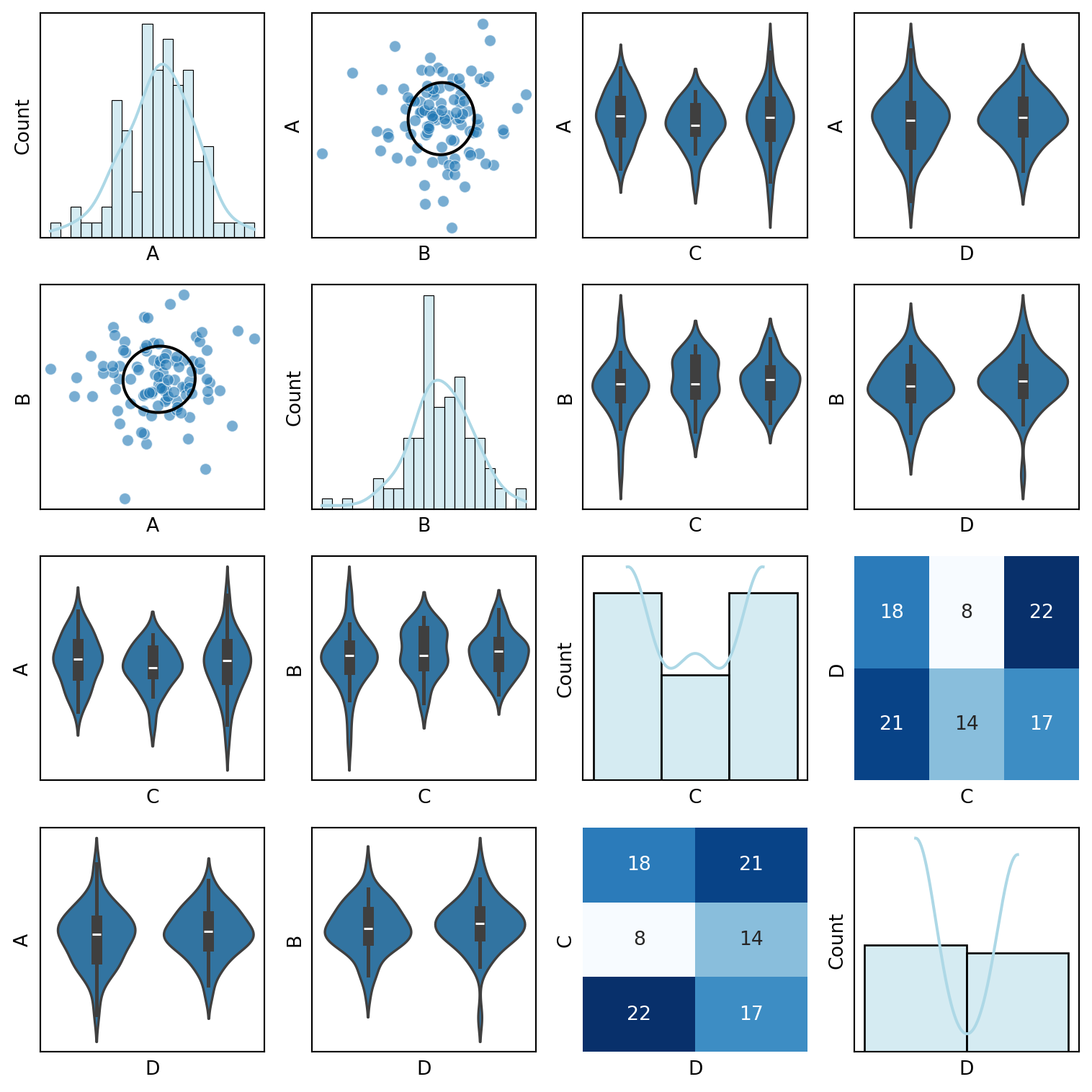
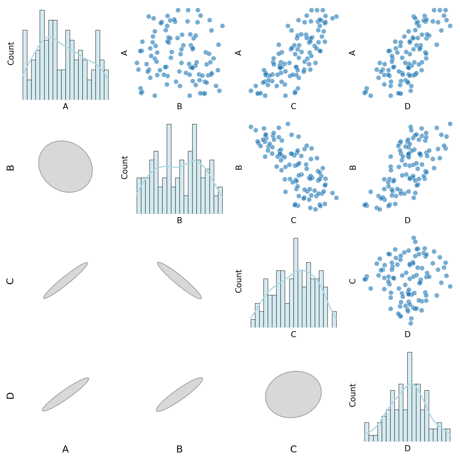
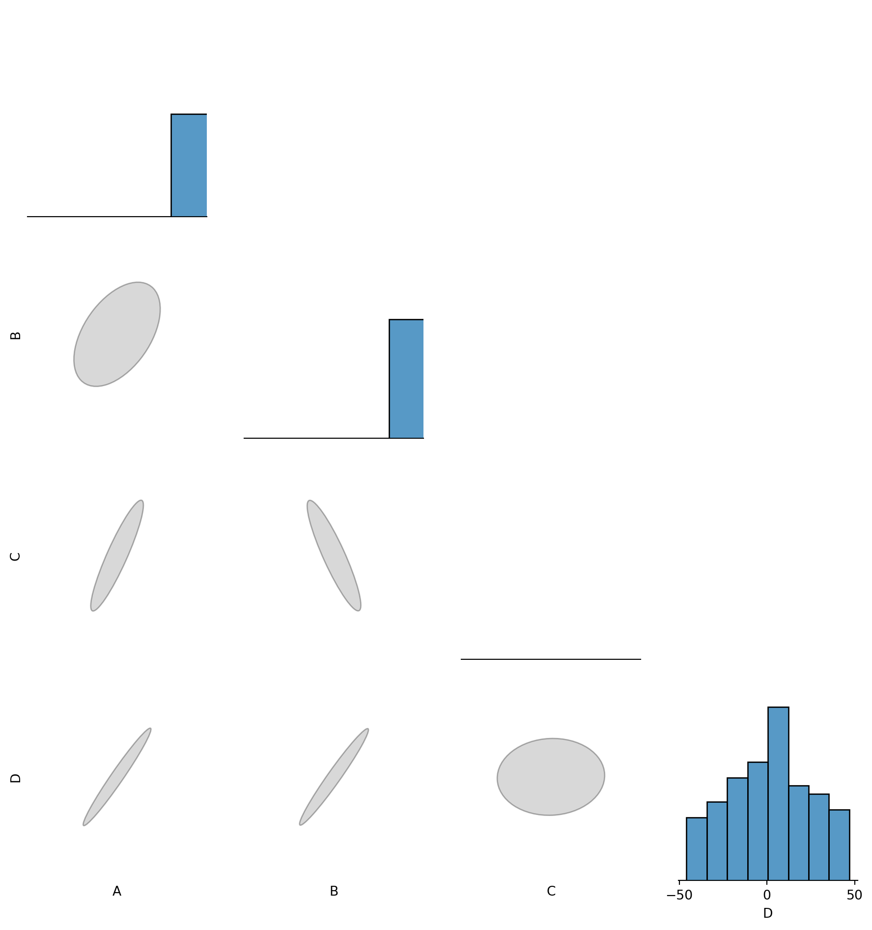
In the notes on I had some ideas about making a better SPLOMs. A splom is a scatterplot matrix.
The first batch of ideas involve making scatterplot more infomative by pickinga more suitable plot type based on the data types of the variables being plotted.
for a continuous vs continuous variable pairs plot a scatter plot.
for a continuous vs discrete variable pairs plot a violin plot.
for a discrete vs discrete variable pairs plot a heatmap.
on the diagonal plot histograms with a density plot overlay.
for the lower triangle of the plot, plot correlation ellipses. And the correlation ellipses can be overlayed with a number for the correlation coefficient.
The second batch of ideas involve making the plot more useful for understanding effects in the data and potential regression issues like outliers and high leverage points, heteroscedasticity, and non-linear relationships. And one more issue that I came across is how to handle zero inflation arising from one or the other variable….
Another thought about SPLOM is to make the cells of the plot three dimensional so we could see the two predictors vs the response variable when we move off the first collumn.
Highlight effects in these plots. using a regression line or a loess line for the main effects.
For the second order effects, we might show the fit a 3d quadratic spline or loess for the two predictors as a surface in a 3d plot. If we were interactive we might also show
The residuals
Error surfaces above and below the fit surface. A sort of confidence interval for the fit
The outliers and high leverage points for the interaction terms. Perhaps as bubbles for the residuals and as points for the outliers and high leverage points.
The zero inflation points. Perhaps as a different color for the residuals.
highlight hetroscedasticity by a residual from a normal distribution….
make the
make it interactive.
import numpy as npimport pandas as pdimport seaborn as snsimport matplotlib.pyplot as pltfrom matplotlib.patches import Ellipsefrom sklearn.preprocessing import LabelEncoderdef correlation_ellipse(ax, x, y, data, **kwargs):"""Plot correlation ellipses like R's circles package.""" cov = np.cov(data[x], data[y]) eigvals, eigvecs = np.linalg.eig(cov) angle = np.degrees(np.arctan2(*eigvecs[:, 0][::-1])) ellipse = Ellipse( xy=(data[x].mean(), data[y].mean()), width=2* np.sqrt(eigvals[0]), height=2* np.sqrt(eigvals[1]), angle=angle, edgecolor='black', facecolor='none', linewidth=1.5 ) ax.add_patch(ellipse)def custom_pair_plot(df):"""Generate a pair plot with scatter plots for continuous variables, violin plots for discrete variables, and correlation ellipses.""" continuous_vars = df.select_dtypes(include=['float64', 'int64']).columns discrete_vars = df.select_dtypes(include=['object', 'category']).columns label_encoders = {col: LabelEncoder().fit(df[col]) for col in discrete_vars} df_encoded = df.copy()# Encode categorical variablesfor col in discrete_vars: df_encoded[col] = label_encoders[col].transform(df[col]) num_vars = df_encoded.shape[1] fig, axes = plt.subplots(num_vars, num_vars, figsize=(2*num_vars, 2*num_vars))for i, var1 inenumerate(df_encoded.columns):for j, var2 inenumerate(df_encoded.columns): ax = axes[i, j]if i == j: sns.histplot(df[var1], ax=ax, kde=True, bins=20, color="lightblue")elif var1 in continuous_vars and var2 in continuous_vars: sns.scatterplot(x=df[var2], y=df[var1], ax=ax, alpha=0.6) correlation_ellipse(ax, var2, var1, df_encoded)elif var1 in discrete_vars and var2 in continuous_vars: sns.violinplot(x=df[var1], y=df[var2], ax=ax)elif var1 in continuous_vars and var2 in discrete_vars: sns.violinplot(x=df[var2], y=df[var1], ax=ax)else: sns.heatmap(pd.crosstab(df[var2], df[var1]), annot=True, fmt="d", cmap="Blues", ax=ax, cbar=False) ax.set_xticks([]) ax.set_yticks([]) plt.tight_layout() plt.show()# Example usagedf = pd.DataFrame({'A': np.random.randn(100),'B': np.random.randn(100) *2,'C': np.random.choice(['Low', 'Medium', 'High'], 100),'D': np.random.choice(['Yes', 'No'], 100)})custom_pair_plot(df)
import numpy as npimport pandas as pdimport seaborn as snsimport matplotlib.pyplot as pltfrom matplotlib.patches import Ellipsefrom sklearn.preprocessing import LabelEncoder, MinMaxScalerdef correlation_ellipse(ax, x, y, data, max_size=1.2):"""Plot a properly scaled correlation ellipse in the lower triangle.""" x_vals = data[x] y_vals = data[y] corr = np.corrcoef(x_vals, y_vals)[0, 1] # Pearson correlation cov = np.cov(x_vals, y_vals) eigvals, eigvecs = np.linalg.eig(cov)# Normalize eigenvalues to ensure uniform ellipse size max_eigenvalue = np.max(eigvals) width, height = max_size * (eigvals / max_eigenvalue) # Scale within a fixed box angle = np.degrees(np.arctan2(*eigvecs[:, 0][::-1])) ellipse = Ellipse( xy=(0, 0), # Centered at (0,0) since we scale manually width=width, height=height, angle=angle, edgecolor='black', facecolor='gray', alpha=0.3 ) ax.add_patch(ellipse)# Fix axis limits to keep all ellipses inside a square ax.set_xlim(-1, 1) ax.set_ylim(-1, 1) ax.set_xticks([]) ax.set_yticks([]) ax.set_frame_on(False) # Remove frame for claritydef custom_pair_plot(df):"""Generate a pair plot where: - Histograms appear on the diagonal. - Scatter & Violin plots are in the upper triangle. - Normalized correlation ellipses appear in the lower triangle. - Labels for the bottom and left axes of ellipses. """ continuous_vars = df.select_dtypes(include=['float64', 'int64']).columns discrete_vars = df.select_dtypes(include=['object', 'category']).columns# Normalize all continuous variables to [0,1] for consistent ellipses scaler = MinMaxScaler() df_encoded = df.copy() df_encoded[continuous_vars] = scaler.fit_transform(df[continuous_vars])# Encode categorical variables label_encoders = {col: LabelEncoder().fit(df[col]) for col in discrete_vars}for col in discrete_vars: df_encoded[col] = label_encoders[col].transform(df[col]) num_vars =len(df_encoded.columns) fig, axes = plt.subplots(num_vars, num_vars, figsize=(2*num_vars, 2*num_vars))for i, var1 inenumerate(df_encoded.columns):for j, var2 inenumerate(df_encoded.columns): ax = axes[i, j]# Diagonal: Histogramsif i == j: sns.histplot(df[var1], ax=ax, kde=True, bins=20, color="lightblue")# Above diagonal: Scatter & Violin plotselif i < j:if var1 in continuous_vars and var2 in continuous_vars: sns.scatterplot(x=df[var2], y=df[var1], ax=ax, alpha=0.6)elif var1 in discrete_vars and var2 in continuous_vars: sns.violinplot(x=df[var1], y=df[var2], ax=ax)elif var1 in continuous_vars and var2 in discrete_vars: sns.violinplot(x=df[var2], y=df[var1], ax=ax)else: sns.heatmap(pd.crosstab(df[var2], df[var1]), annot=True, fmt="d", cmap="Blues", ax=ax, cbar=False)# Below diagonal: Correlation ellipseselse: correlation_ellipse(ax, var2, var1, df_encoded)# Add axis labels for the bottom row and left-most columnif i == num_vars -1: ax.set_xlabel(var2, fontsize=12)if j ==0: ax.set_ylabel(var1, fontsize=12, rotation=90) ax.set_xticks([]) ax.set_yticks([]) ax.set_frame_on(False) # Remove frame for clarity plt.tight_layout() plt.show()# Test dataset with very different scalesa = np.random.uniform(size=100)b = np.random.uniform(size=100)df = pd.DataFrame({'A': (a) *100.0,'B': (b) *100.0,'C': (a - b) -100.0, 'D': (a + b) *50.0-50.0,})custom_pair_plot(df)
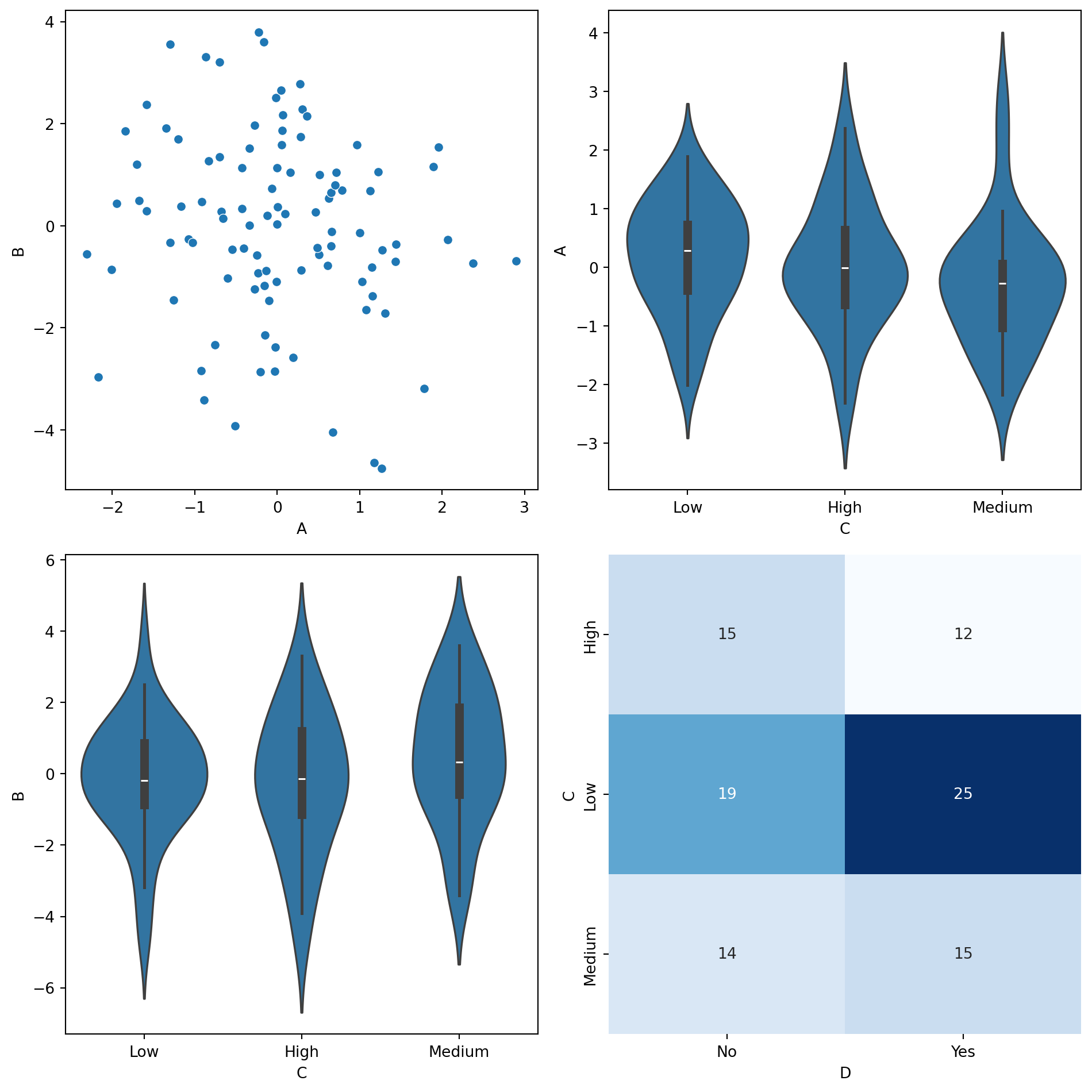
import numpy as npimport pandas as pdimport seaborn as snsimport matplotlib.pyplot as pltdef smart_sns_plot(x, y, data, ax=None, **kwargs):""" Automatically delegates to sns.scatterplot, sns.violinplot, or sns.heatmap based on the data types of x and y. - Continuous vs. Continuous → sns.scatterplot - Continuous vs. Discrete → sns.violinplot - Discrete vs. Discrete → sns.heatmap """if ax isNone: ax = plt.gca()# Determine data types x_dtype = data[x].dtype y_dtype = data[y].dtype is_x_cont = np.issubdtype(x_dtype, np.number) is_y_cont = np.issubdtype(y_dtype, np.number)if is_x_cont and is_y_cont:# Continuous vs. Continuous → Scatter Plot sns.scatterplot(x=x, y=y, data=data, ax=ax, **kwargs)elif is_x_cont andnot is_y_cont:# Continuous vs. Discrete → Violin Plot sns.violinplot(x=y, y=x, data=data, ax=ax, **kwargs)elifnot is_x_cont and is_y_cont:# Discrete vs. Continuous → Violin Plot (flipped) sns.violinplot(x=x, y=y, data=data, ax=ax, **kwargs)else:# Discrete vs. Discrete → Heatmap cross_tab = pd.crosstab(data[x], data[y]) sns.heatmap(cross_tab, annot=True, fmt="d", cmap="Blues", ax=ax, cbar=False)return ax # Return the modified axis# Example Usagedf = pd.DataFrame({'A': np.random.randn(100),'B': np.random.randn(100) *2,'C': np.random.choice(['Low', 'Medium', 'High'], 100),'D': np.random.choice(['Yes', 'No'], 100)})fig, axes = plt.subplots(2, 2, figsize=(10, 10))# Scatterplot (Continuous vs Continuous)smart_sns_plot("A", "B", df, ax=axes[0, 0])# Violinplot (Continuous vs Discrete)smart_sns_plot("A", "C", df, ax=axes[0, 1])# Violinplot (Flipped Discrete vs Continuous)smart_sns_plot("C", "B", df, ax=axes[1, 0])# Heatmap (Discrete vs Discrete)smart_sns_plot("C", "D", df, ax=axes[1, 1])plt.tight_layout()plt.show()
import numpy as npimport pandas as pdimport seaborn as snsimport matplotlib.pyplot as pltfrom matplotlib.patches import Ellipsefrom sklearn.preprocessing import MinMaxScalerdef sns_correlation_ellipse(x, y, data, ax=None, max_size=1.2, **kwargs):""" Seaborn-compatible function that plots a correlation ellipse based on the covariance of x and y. - Uses eigenvectors/eigenvalues of covariance matrix. - Normalizes ellipse size for consistent visuals. - Designed for use in sns.pairplot or FacetGrid. """if ax isNone: ax = plt.gca()# Standardize data for consistent ellipses scaler = MinMaxScaler() scaled_data = scaler.fit_transform(data[[x, y]]) x_vals, y_vals = scaled_data[:, 0], scaled_data[:, 1]# Compute covariance and eigen decomposition cov = np.cov(x_vals, y_vals) eigvals, eigvecs = np.linalg.eig(cov)# Normalize ellipse size (ensures all ellipses fit in a fixed-size box) max_eigenvalue = np.max(eigvals) width, height = max_size * (eigvals / max_eigenvalue) angle = np.degrees(np.arctan2(*eigvecs[:, 0][::-1]))# Draw ellipse at the center ellipse = Ellipse( xy=(0, 0), width=width, height=height, angle=angle, edgecolor="black", facecolor="gray", alpha=0.3 ) ax.add_patch(ellipse)# Fix axis limits so all ellipses are comparable ax.set_xlim(-1, 1) ax.set_ylim(-1, 1) ax.set_xticks([]) ax.set_yticks([]) ax.set_frame_on(False)return ax # Return modified axis# Example Dataa = np.random.uniform(size=100)b = np.random.uniform(size=100)df = pd.DataFrame({'A': (a) *100.0,'B': (b) *100.0,'C': (a - b) -100.0, 'D': (a + b) *50.0-50.0,})# Test with individual plotsfig, ax = plt.subplots(figsize=(4, 4))sns_correlation_ellipse("A", "B", df, ax=ax)plt.show()
g = sns.pairplot(df, kind="scatter", corner=True)for i, row_var inenumerate(df.columns):for j, col_var inenumerate(df.columns):if i > j: # Only lower triangle sns_correlation_ellipse(row_var, col_var, df, ax=g.axes[i, j])plt.show()
import numpy as npimport pandas as pdimport seaborn as snsimport matplotlib.pyplot as pltfrom matplotlib.patches import Ellipsefrom sklearn.preprocessing import MinMaxScalerdef sns_correlation_ellipse(x, y, data, ax=None, max_size=1.2, **kwargs):""" Seaborn-compatible function that plots a correlation ellipse based on the covariance of x and y. - Uses eigenvectors/eigenvalues of covariance matrix. - Normalizes ellipse size for consistent visuals. - Designed for use in sns.pairplot or FacetGrid. """if ax isNone: ax = plt.gca()# Standardize data for consistent ellipses scaler = MinMaxScaler() scaled_data = scaler.fit_transform(data[[x, y]]) x_vals, y_vals = scaled_data[:, 0], scaled_data[:, 1]# Compute covariance and eigen decomposition cov = np.cov(x_vals, y_vals) eigvals, eigvecs = np.linalg.eig(cov)# Normalize ellipse size (ensures all ellipses fit in a fixed-size box) max_eigenvalue = np.max(eigvals) width, height = max_size * (eigvals / max_eigenvalue) angle = np.degrees(np.arctan2(*eigvecs[:, 0][::-1]))# Draw ellipse at the center ellipse = Ellipse( xy=(0, 0), width=width, height=height, angle=angle, edgecolor="black", facecolor="gray", alpha=0.3 ) ax.add_patch(ellipse)# Fix axis limits so all ellipses are comparable ax.set_xlim(-1, 1) ax.set_ylim(-1, 1) ax.set_xticks([]) ax.set_yticks([]) ax.set_frame_on(False)return ax # Return modified axisdef smart_sns_plot(x, y, data, ax=None, **kwargs):""" Automatically delegates to sns.scatterplot, sns.violinplot, or sns.heatmap based on the data types of x and y. - Continuous vs. Continuous → sns.scatterplot - Continuous vs. Discrete → sns.violinplot - Discrete vs. Discrete → sns.heatmap """if ax isNone: ax = plt.gca()# Determine data types x_dtype = data[x].dtype y_dtype = data[y].dtype is_x_cont = np.issubdtype(x_dtype, np.number) is_y_cont = np.issubdtype(y_dtype, np.number)if is_x_cont and is_y_cont:# Continuous vs. Continuous → Scatter Plot sns.scatterplot(x=x, y=y, data=data, ax=ax, **kwargs)elif is_x_cont andnot is_y_cont:# Continuous vs. Discrete → Violin Plot sns.violinplot(x=y, y=x, data=data, ax=ax, **kwargs)elifnot is_x_cont and is_y_cont:# Discrete vs. Continuous → Violin Plot (flipped) sns.violinplot(x=x, y=y, data=data, ax=ax, **kwargs)else:# Discrete vs. Discrete → Heatmap cross_tab = pd.crosstab(data[x], data[y]) sns.heatmap(cross_tab, annot=True, fmt="d", cmap="Blues", ax=ax, cbar=False)return ax # Return the modified axis# Example Dataa = np.random.uniform(size=100)b = np.random.uniform(size=100)df = pd.DataFrame({'A': (a) *100.0,'B': (b) *100.0,'C': (a - b) -100.0, 'D': (a + b) *50.0-50.0,'E': np.random.choice(['Low', 'Medium', 'High'], 100),'F': np.random.choice(['Yes', 'No'], 100)})# Create PairGridg = sns.PairGrid(df, diag_sharey=False)# Upper Triangle: Use smart_sns_plotg.map_upper(smart_sns_plot)# Lower Triangle: Use sns_correlation_ellipseg.map_lower(sns_correlation_ellipse)# Diagonal: Histogramsg.map_diag(sns.histplot, kde=True, bins=20, color="lightblue")plt.show()
---------------------------------------------------------------------------TypeError Traceback (most recent call last)
Cell In[6], line 103 100 g = sns.PairGrid(df, diag_sharey=False)
102# Upper Triangle: Use smart_sns_plot--> 103g.map_upper(smart_sns_plot) 105# Lower Triangle: Use sns_correlation_ellipse 106 g.map_lower(sns_correlation_ellipse)
File ~/work/notes/notes-islr-py/.venv/lib/python3.10/site-packages/seaborn/axisgrid.py:1410, in PairGrid.map_upper(self, func, **kwargs) 1399"""Plot with a bivariate function on the upper diagonal subplots. 1400 1401Parameters (...) 1407 1408""" 1409 indices =zip(*np.triu_indices_from(self.axes, 1))
-> 1410self._map_bivariate(func,indices,**kwargs) 1411returnself
File ~/work/notes/notes-islr-py/.venv/lib/python3.10/site-packages/seaborn/axisgrid.py:1574, in PairGrid._map_bivariate(self, func, indices, **kwargs) 1572if ax isNone: # i.e. we are in corner mode 1573continue-> 1574self._plot_bivariate(x_var,y_var,ax,func,**kws) 1575self._add_axis_labels()
1577if"hue"in signature(func).parameters:
File ~/work/notes/notes-islr-py/.venv/lib/python3.10/site-packages/seaborn/axisgrid.py:1583, in PairGrid._plot_bivariate(self, x_var, y_var, ax, func, **kwargs) 1581"""Draw a bivariate plot on the specified axes.""" 1582if"hue"notin signature(func).parameters:
-> 1583self._plot_bivariate_iter_hue(x_var,y_var,ax,func,**kwargs) 1584return 1586 kwargs = kwargs.copy()
File ~/work/notes/notes-islr-py/.venv/lib/python3.10/site-packages/seaborn/axisgrid.py:1659, in PairGrid._plot_bivariate_iter_hue(self, x_var, y_var, ax, func, **kwargs) 1657 func(x=x, y=y, **kws)
1658else:
-> 1659func(x,y,**kws) 1661self._update_legend_data(ax)
TypeError: smart_sns_plot() missing 1 required positional argument: 'data'
Reuse
CC SA BY-NC-ND
Citation
BibTeX citation:
@online{bochman2024,
  author = {Bochman, Oren},
  title = {Better {SPLOM}},
  date = {2024-06-01},
  url = {https://orenbochman.github.io/notes-islr/posts/better-splom/},
  langid = {en}
}